Making Kapwing's New Brand
Say hello to the new Kapwing! We've refreshed our look to better represent who we are and the community of creators we set out to serve. Read on to learn how we developed our new logo, colors, mascots, and visual identity.

For the past five years, Kapwing’s team has been dedicated to building a creative platform that allows people to create and repurpose content directly in their browser. They’ve released dozens of AI-powered tools to streamline the modern creation process, grown a dedicated worldwide following (including past users like Snoop Dogg!), and recently hit a milestone of serving 10 million registered creators. But as their product has evolved and grown, they realized that it was time to bring the company’s visual branding up to speed.

Enter yours truly.
I joined Kapwing four months ago as its first Brand Designer. I’m a graphic designer and visual artist by trade, but I’ve always had a huge side passion for film myself — and so it was a dream come true for me to work on building a design system from the ground up for a startup meant to serve other creatives. From the moment I joined, I couldn’t wait to explore the possibilities of where we could take our branding.
So here’s where we took it.
The foundations of a new start

When I first joined, what excited me about Kapwing’s original branding was that it already had a lot of existing character – in fact, it was the purple cat logo that first attracted me to apply to the company. In a market saturated with countless tech startups, having such an approachable (and frankly, cute) character front and center got me curious about what Kapwing had to offer. And so when I joined the team and was given the task of revamping our visual identity, I knew I wanted to elevate our look while still preserving and enhancing the qualities that make us unique.
That said, I still wanted to do a pretty major upheaval. Our old branding was functional but had a lot of room for improvement. My main critiques were that:
- Our visual system was inconsistent from channel to channel — there wasn’t one cohesive look and feel that unified everything together, meaning our branding wasn’t as impactful as it could be. The posts we made on Instagram looked different from our YouTube thumbnails, which looked different from our website. In developing a new design system, I wanted us to move forward with a consistent visual language that our audiences could recognize immediately as Kapwing.
- Our old logo and color palette didn’t feel very intentional. The cat logo didn’t visually communicate our company values or what our product does — and some people even mistook the cat for an owl. Our brand color palette also wasn’t implemented very consistently. Hex codes differed, random non-branded colors were thrown into assets, and our primary Kapwing purple was hard to work with.
- And finally, a lot of our old design elements looked a bit dated or generally lacked visual polish. Before I joined Kapwing, all of our visual assets were created by engineers or marketers. The team did a good job with the resources they had at their disposal, but it was hard for them to put together graphics that were compelling in the same way that companies with dedicated design teams could.
Overall, our old branding didn’t quite align with our main messaging pillars of championing modernity and creativity. In the four months that I’ve been here, I’ve worked to give the company a brand new look that’ll better represent both who we are and the community of creators we set out to serve.
I’d like to introduce to you the new face of Kapwing. We’re taking our branding to the next level by making it bolder, more exciting, and more professional. And this is just the start.
Time(line) for a new logo
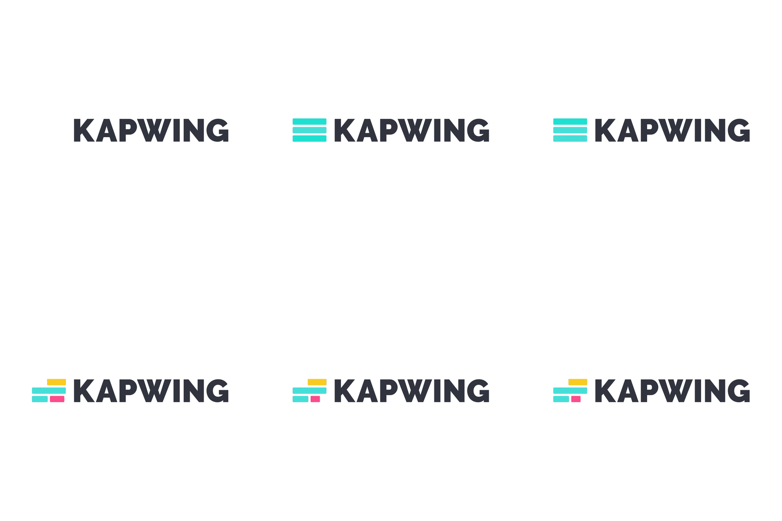
As we’ve grown our user base and showed the market that we’re a powerful, world-class product, I felt that it was important for us to move away from our old cat logo. It was time for something more abstract and sophisticated, so I developed a new logo inspired by our studio timeline.
Our refreshed logo incorporates the three primary colors of our updated brand palette, which are a departure from the old Kapwing purple. It also remedies the main issue with our cat logo, which felt too removed from what we do as a company. This abstracted timeline shape carries with it a more immediate connection to video editing, so it better visually communicates what our product is from a glance. Our new logo is sleek, elegant, and better represents Kapwing as the modern content creation platform that it is.
Goodbye purple, hello cyan
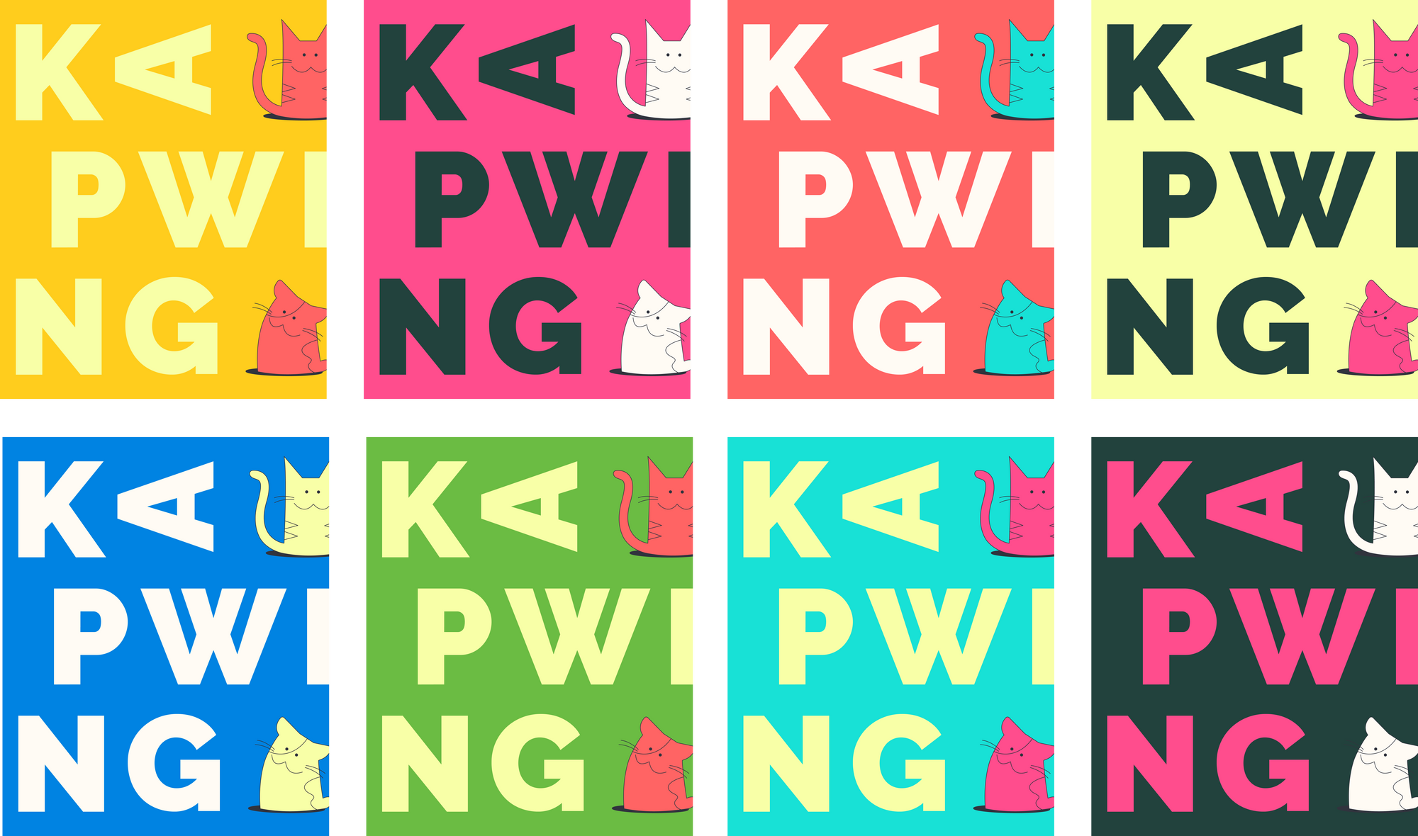
A good color palette is one of the mainstays of meaningful (and recognizable) branding. Colors help to set the tone for a company and communicate its core values. I wanted Kapwing to have a palette that would set us apart from the rest of the market: something saturated, exciting, and eye catching. But I also wanted our brand palette to directly tie into our product as an image and video repurposing platform.

Our three primary colors were inspired by the CMYK color palette. I wanted our new brand to have primary brand colors that represented the foundations of creativity — the idea being that you can mix the CMYK swatches together to create any other color, just like creators can use our tools and platform to serve their needs and carry out their own creative visions.
The RGB color palette could’ve also fit this meaning, but I was immediately drawn towards the CMYK palette instead because it was less conventional. Plenty of other companies use RGB in their branding and logos, and I wanted primary colors that people could instantly recognize in the creative field, but would still resonate as being uniquely Kapwing.

The rest of our color palette is an homage to the classic TV calibration screen. This pattern used to air between screenings of programs on cable TV before there was content being broadcasted 24/7, so these colors are symbolic of the idea that we’re waiting for our users to create content of their own. It also further reinforces our connection to the art of filmmaking and the video medium, which I wanted to infuse into all aspects of our branding.
Kit’s out of the bag
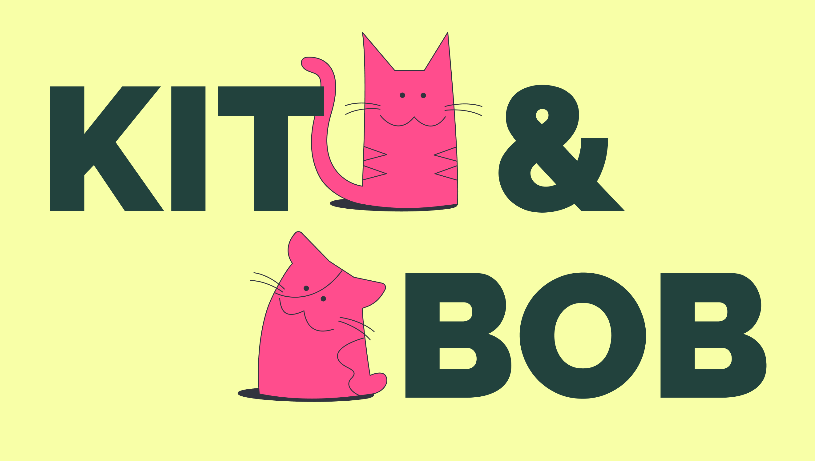
Although the purple cat is stepping down from being our logo, I wanted to keep cats at the heart of Kapwing as our company mascots. We’ve received an outpouring of positive feedback about our kittens over the years, and we were even gifted a hand-crocheted Kapwing cat once (which is still proudly on display in our San Francisco office). Clearly, the cats are something that have always set us apart in terms of uniqueness and likability.
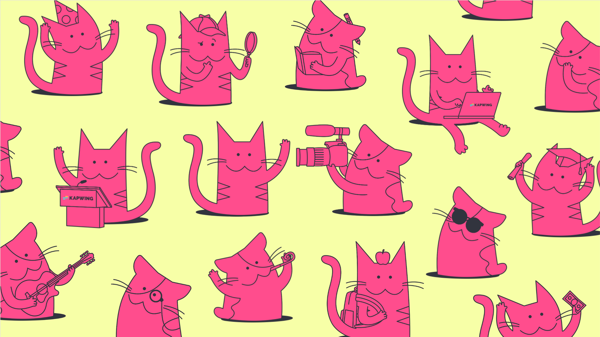
I’m excited to introduce our new Kapwing mascots: Kitten and Bobtail (or Kit and Bob, for short). Their designs build off of our original logo, adapting its familiar silhouette into two different cats: a tabby and a calico. But while our old cat was stylized to only have eyes and a large triangular nose, causing many people to confuse it with an owl, our new mascots are stylized with eyes and mouths to avoid that misconception in the future. Their faces are meant to also invoke the classic :3 emoticon, which has always been prominent in early internet and meme culture.
A photo’s worth a thousand edits

Photo portraiture offers a great way to spotlight our team and our amazing Kapwing community. But photography can also get tricky from a branding perspective because of the lack of consistency from photo to photo. As a small startup, a lot of our photos are spur-of-the-moment phone pics or images sourced from our worldwide community of Kapwing creators, so there’s a great deal of variation in terms of the portraits’ backgrounds and color grading.
Our new photo approach consists of cropping out and desaturating the subjects to ensure that the photography treatments look consistent regardless. Including abstract shapes in the background helps to add in visual interest, to tie together all our photos as one cohesive system, and to bring in our color palette and even further connect it with our brand.
Video production, in motion
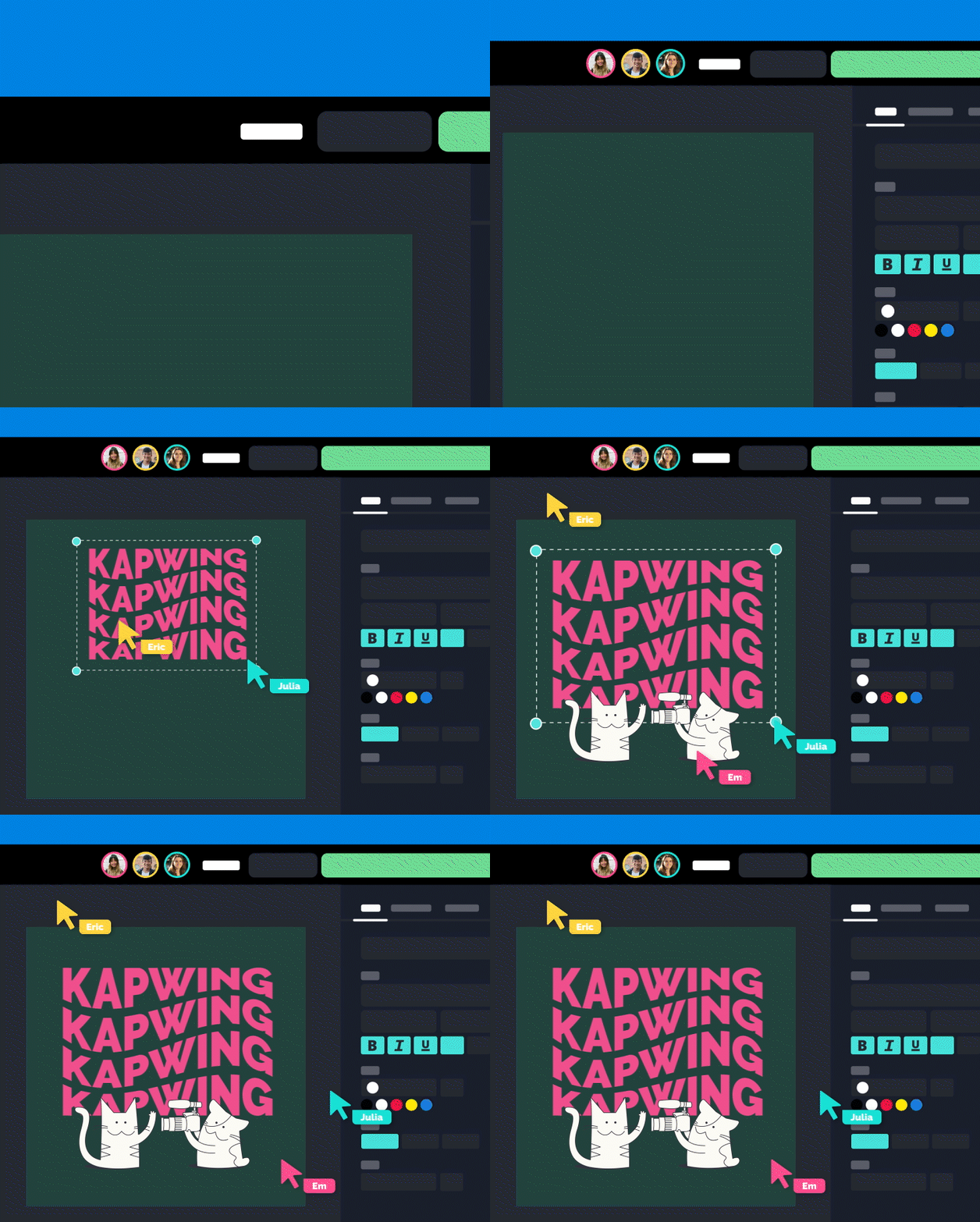
Moving forward, animations are going to be a major cornerstone of our new branding and how we visually communicate with our audiences on our website and across different social media channels. They highlight the powerful and collaborative features our studio has to offer, so people are now able to actually visualize the things they can do in Kapwing — and let’s face it, seeing things in action is so much more impactful and inspiring than seeing a static screenshot.
These product visualizations are also abstracted enough so that any potentially distracting elements are eliminated. The Kapwing studio and workspaces will look streamlined in our animations so that new users aren’t overwhelmed and people can instead focus on the features we’re showcasing.
Illustrating our values
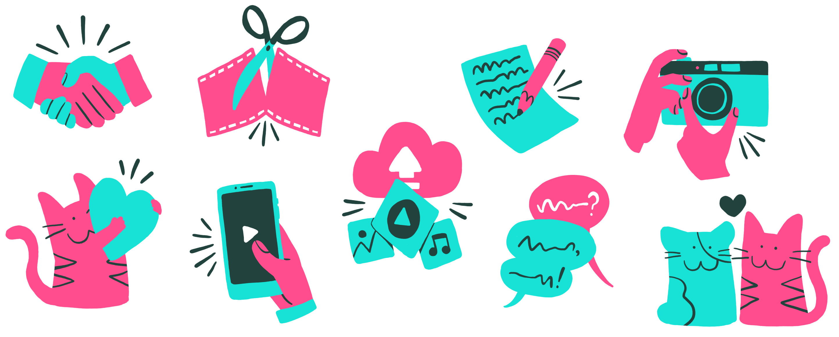
Although we now have a robust library of Kit and Bob vector illustrations, I also wanted to flesh out a collection of hand-drawn icons to use on our website. These will be used more sparingly, mostly as supplemental visuals to accompany the copy in bulleted lists and charts. One of Kapwing’s core values is authenticity, and I’ve always felt that there was something uniquely authentic and approachable about hand-drawn illustrations, so I definitely wanted to make space for that medium in our new branding as well. Whether it’s these icons or larger standalone pieces you might spot on our website and merch, illustrations will always have a welcome place in our visual language.
Upping our social game
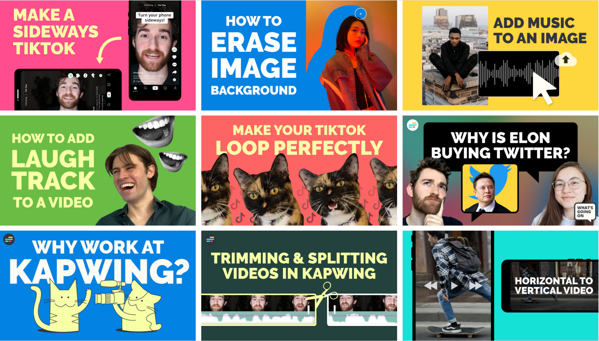
Individual thumbnails may only be a few pixels large, but together they can paint a larger picture of our visual identity on social media platforms. Over the past few months, making thumbnails for our YouTube channel was a great exercise for our new branding since they’re relatively low risk and allow for a great deal of visual experimentation. Kapwing’s social posts are driving home our bolder, cleaner, more exciting approach, and they’ll adhere to this consistent design system from here on out.
Kapwing.com 2.0
Last but most certainly not least, we redesigned our entire website to reflect the spirit of our new branding. All of our new pages are infused with the refreshed Kapwing color palette and graphic treatments I’ve covered in this article, capturing the vibrancy and playfulness of our brand. Our new homepage also utilizes custom animations to better represent our product features, and this added sense of motion makes it a lot more visually engaging for our audience.
Onwards and upwards
Kapwing has helped millions of creators tell their stories, and now it’s time for us to tell our story more boldly and authentically than ever before.
I’m thrilled and honored that I got to develop a new visual system that will help Kapwing better express our values and who were are as a company. We’re the same great platform, just with a brand new look — and we’re excited to continue on our mission to help creators around the world make great content. Check out our new website using the button below, and be sure to also stop by our YouTube, TikTok, Instagram, and Twitter!

