How to Get 'New' Instagram Fonts (2026)
How to get seven new fonts, six new tools, and a hidden font you may have missed on Instagram.

In late August 2024, Instagram released an update that is redefining how users design their posts, Stories, and Reels. By integrating new fonts with creative text tools, this update gives creators more ways to make their content pop, whether it's promo content, adverts, or memes.
Instagram Design Studio art director Kristofer Porter spoke of the new font choices, explaining their range of styles from "distinctive" to "everyday":
"How can we bring fresh perspective to familiar type styles in a way that feels distinctive while also providing useful, reliable, everyday options for creators to share their content?”
Whether you’re a brand looking to captivate your audience or a creator aiming to add personality to your posts, these new features can help make storytelling more dynamic and visually appealing.
Below, we explore the details of the new Instagram fonts, explain how to get them, and provide a list of comparable Google Fonts to maintain a consistent look across different social media platforms.
Table of Contents:
- How to Access Text Tools on Instagram
- How to Get New Fonts on Instagram
- Combining Google Fonts and Kapwing for Unified Branding
- Which Font to Use On Instagram
- How to Edit Text on Instagram
- New Animations and Text Effects
- Hidden Fonts: How to Get the Papyrus Font on Instagram
How to Access Text Tools on Instagram
Instagram's 15 font options are the same for both Reels and Stories. Start by uploading the media you want to share.
For Stories, tap anywhere on the screen to create a text layer and begin typing. If you’re working on a post or a Reel, select the text layer icon, represented by the "Aa" symbol, to add your text.
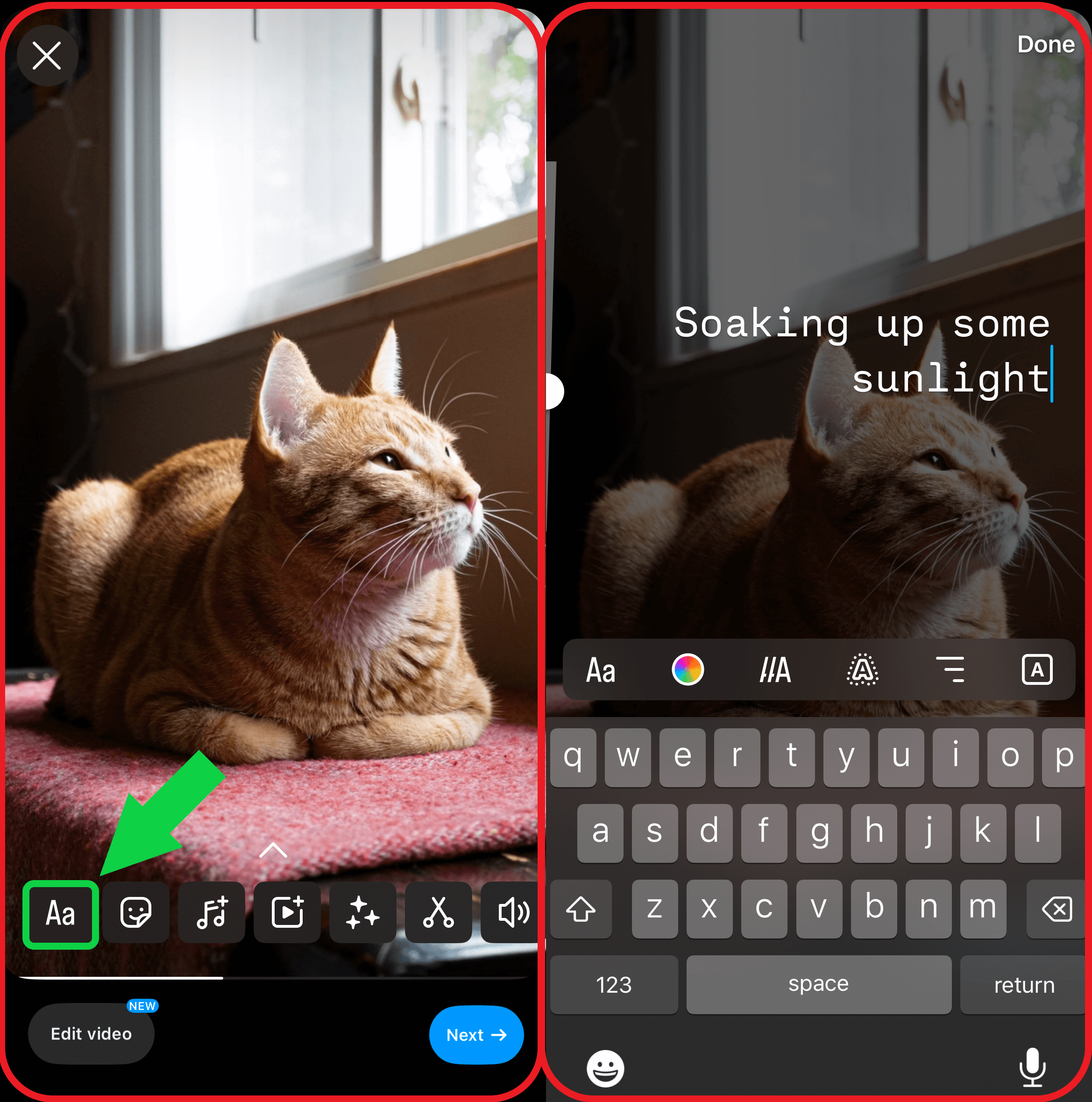
The font options for your new text layer appear above the keyboard.
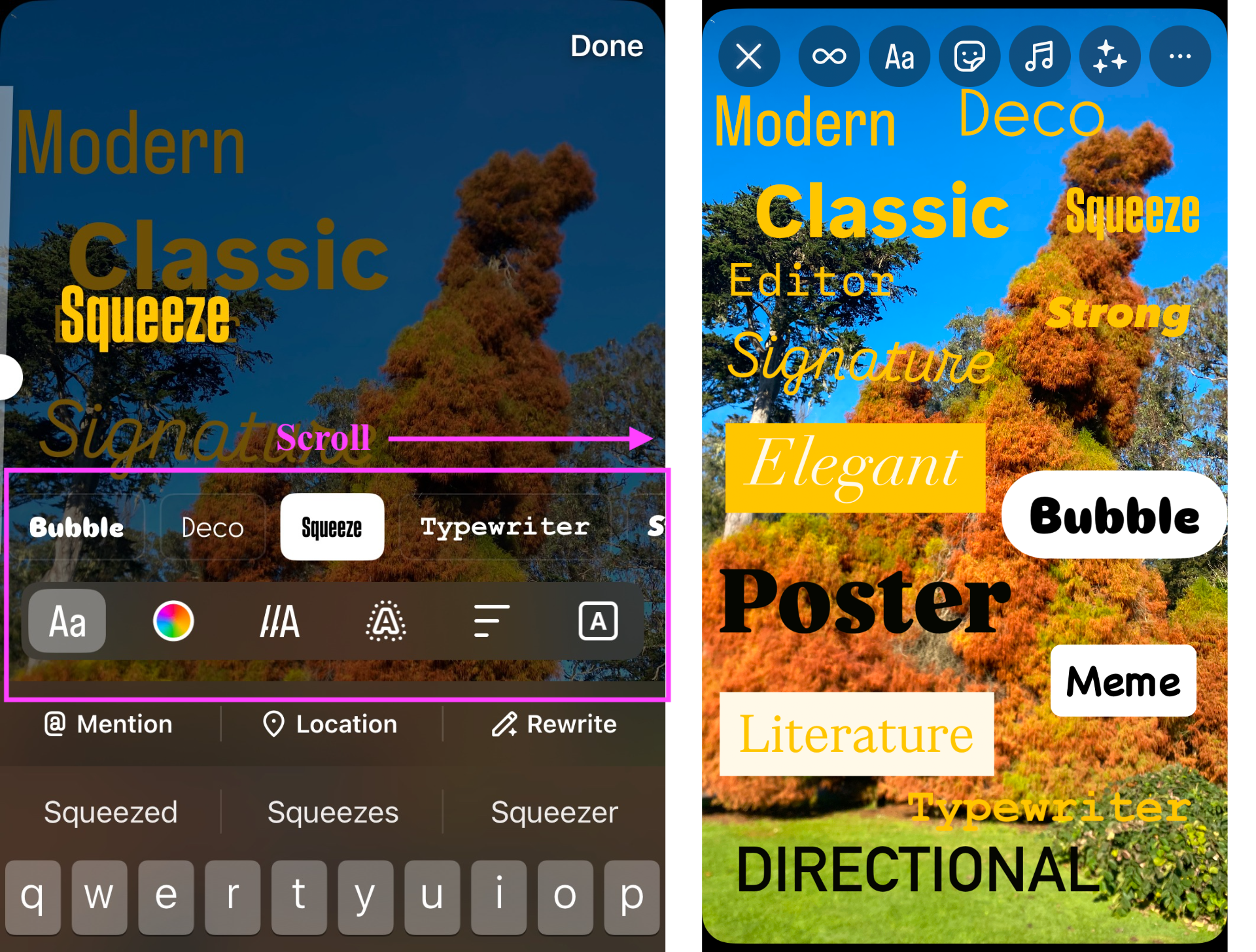
There are 15 different options, each represented by a word shown in the corresponding font. Scroll through them horizontally to preview what the font will look like with your text layer.
How to Get New Fonts on Instagram
Instagram has added six new fonts. Meta released these new fonts to a set of Instagram beta testers before they were released to the public in late 2024, first on Stories and now on Reels. They also added six effects and animations.
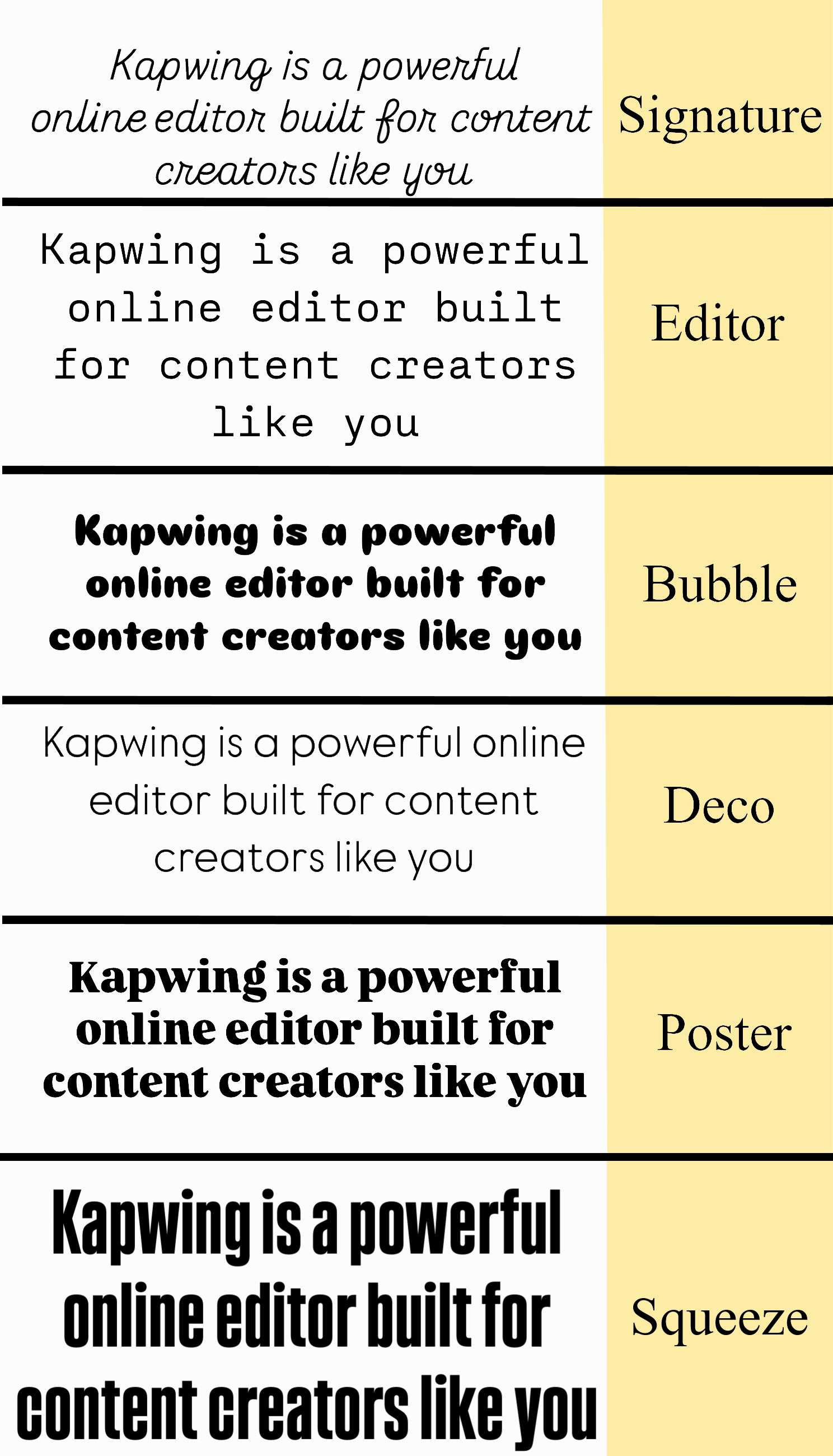
Before, fonts were represented with a single icon. Now, the fonts have names. Here are the names of the 7 new fonts:
- Signature: Lighthearted and inviting, this font mimics handwriting with a mix of cursive and print characters, making it ideal for personal or casual messages.
- Editor: A retro-inspired, widely spaced serif font perfect for formal announcements and clean, minimal aesthetics.
- Bubble: Playful and bold, this typeface features soft, rounded edges that convey an approachable, jovial vibe.
- Deco: Confident and alternative, this font is excellent for delivering impactful messages with a touch of flair.
- Poster: A bold typeface with expressive serifs. Use it to create contrast and ensure your text becomes the focal point.
- Squeeze: An expressive and loud typeface crafted to grab attention. Its striking design is particularly effective for short phrases and captions.
- Journal: A cursive, girly, and handwritten typeface. As evident by its name, this font is perfect for journalistic, personal text.
And new, limited edition fonts as of 2026:
- Rosalia: A splotchy, handwritten font created to simulate handwritten messages with unique capitalization.
- New Year: A glittery, celebratory font released for the New Year. Cursive, girly, and stylish, this font is perfect to pair with your NYE posts.

These joined the 9 existing font options in Instagram Stories: Modern, Classic, Typewriter, Strong, Meme, Elegant, Directional, and Literature.
When creating content on platforms other than Instagram, you may want to replicate the aesthetic of your Instagram posts. While Instagram doesn’t provide direct downloads for its fonts due to copyright restrictions, you may wish to use Google Fonts alternatives that closely resemble their Instagram counterparts.
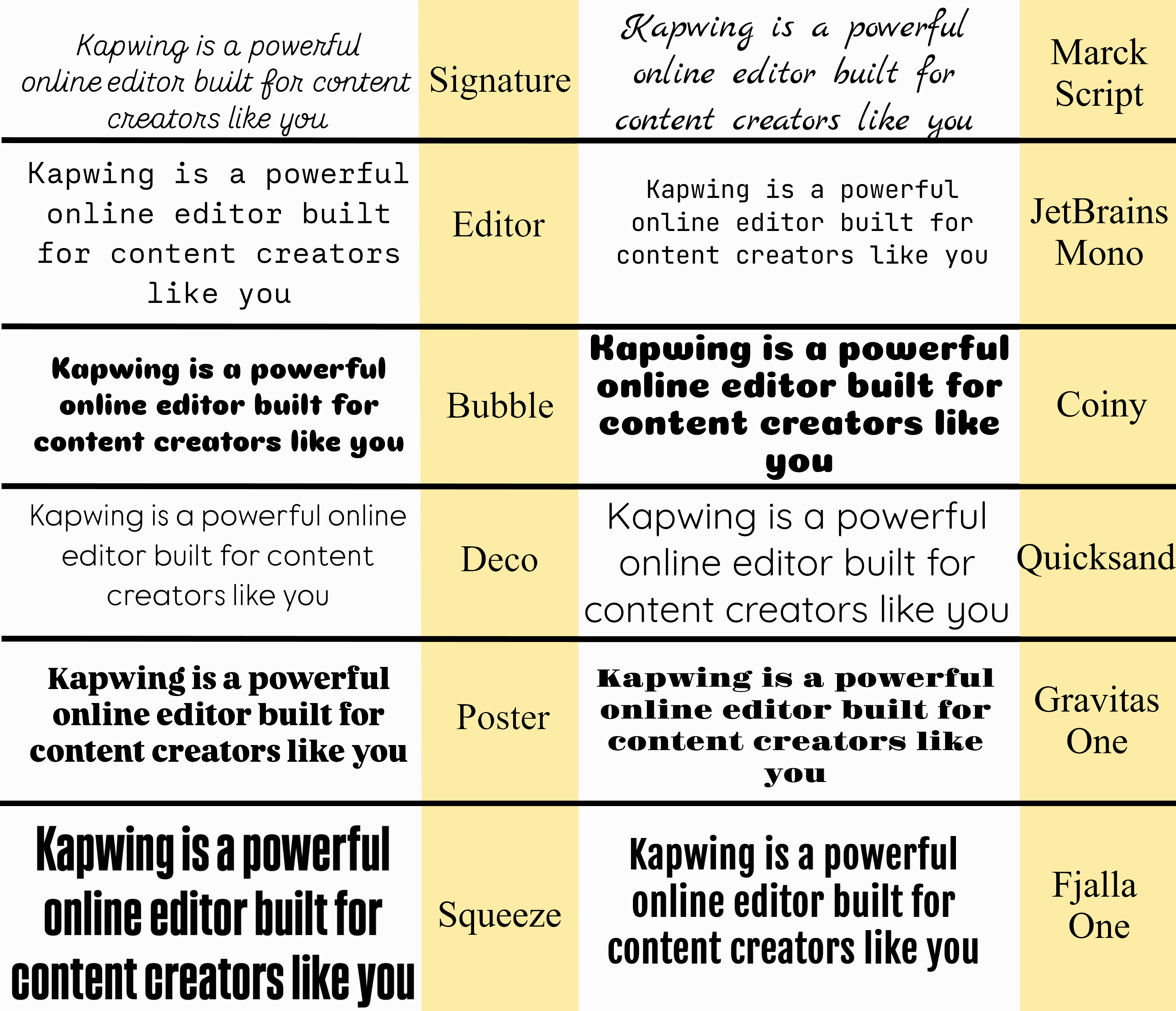
Here are the six new Instagram fonts, compared side by side with their copyright-free alternatives, all of which are supported by Kapwing:
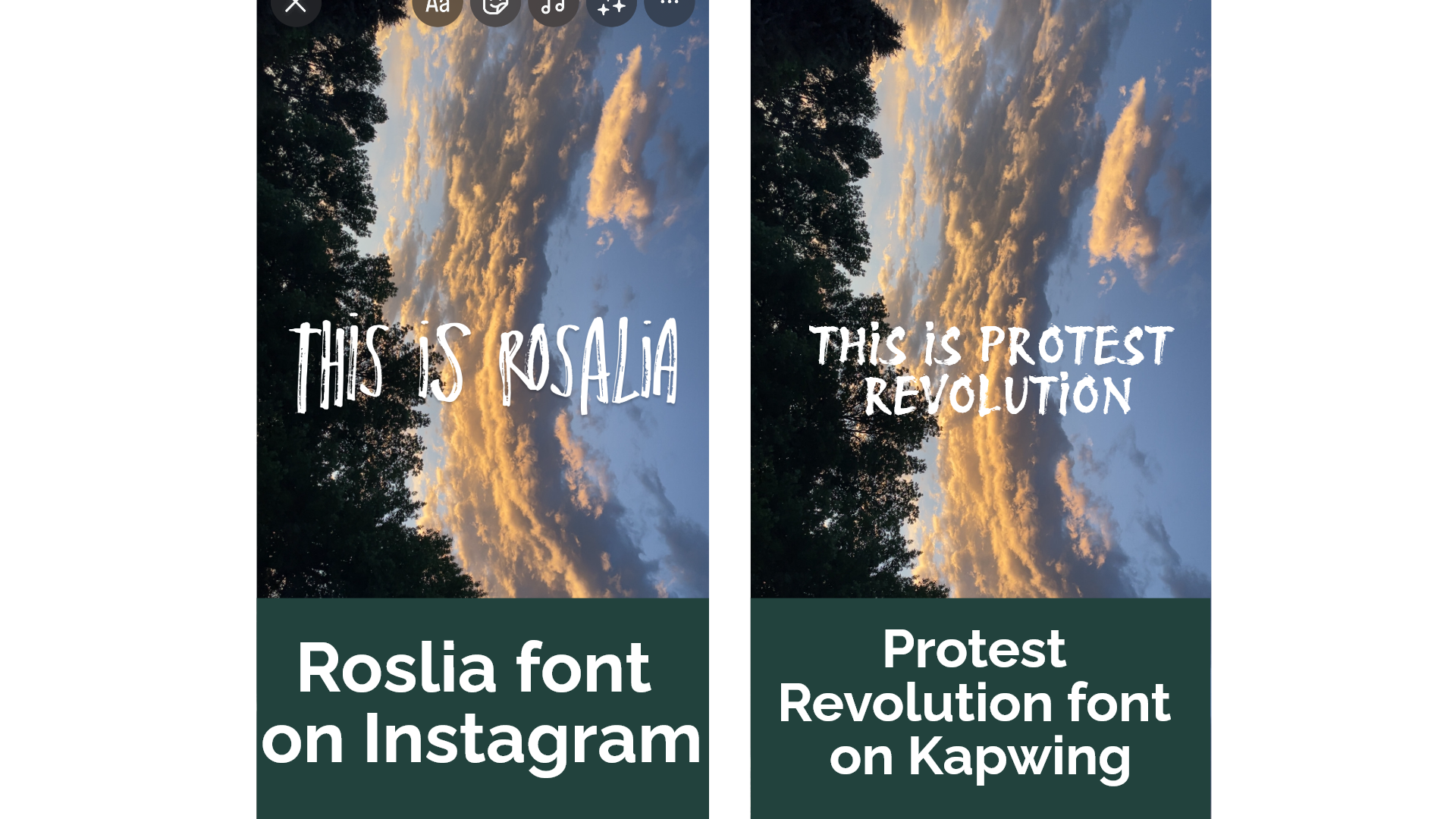
Rosalia
- Google alternative: Protest Revolution — A distressed, marker font.
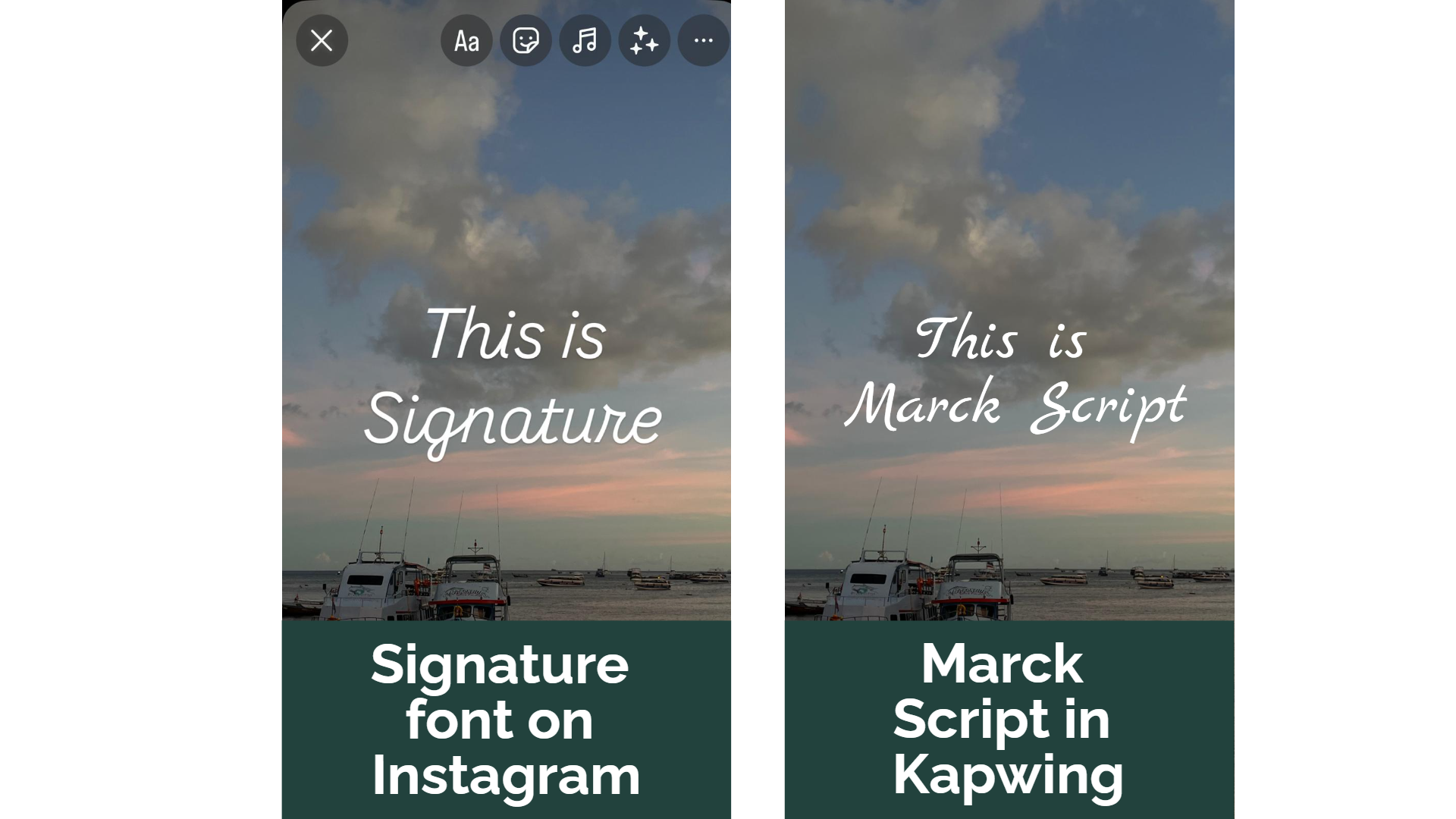
Signature
- Google alternative: Marck Script — A light and casual handwritten style.
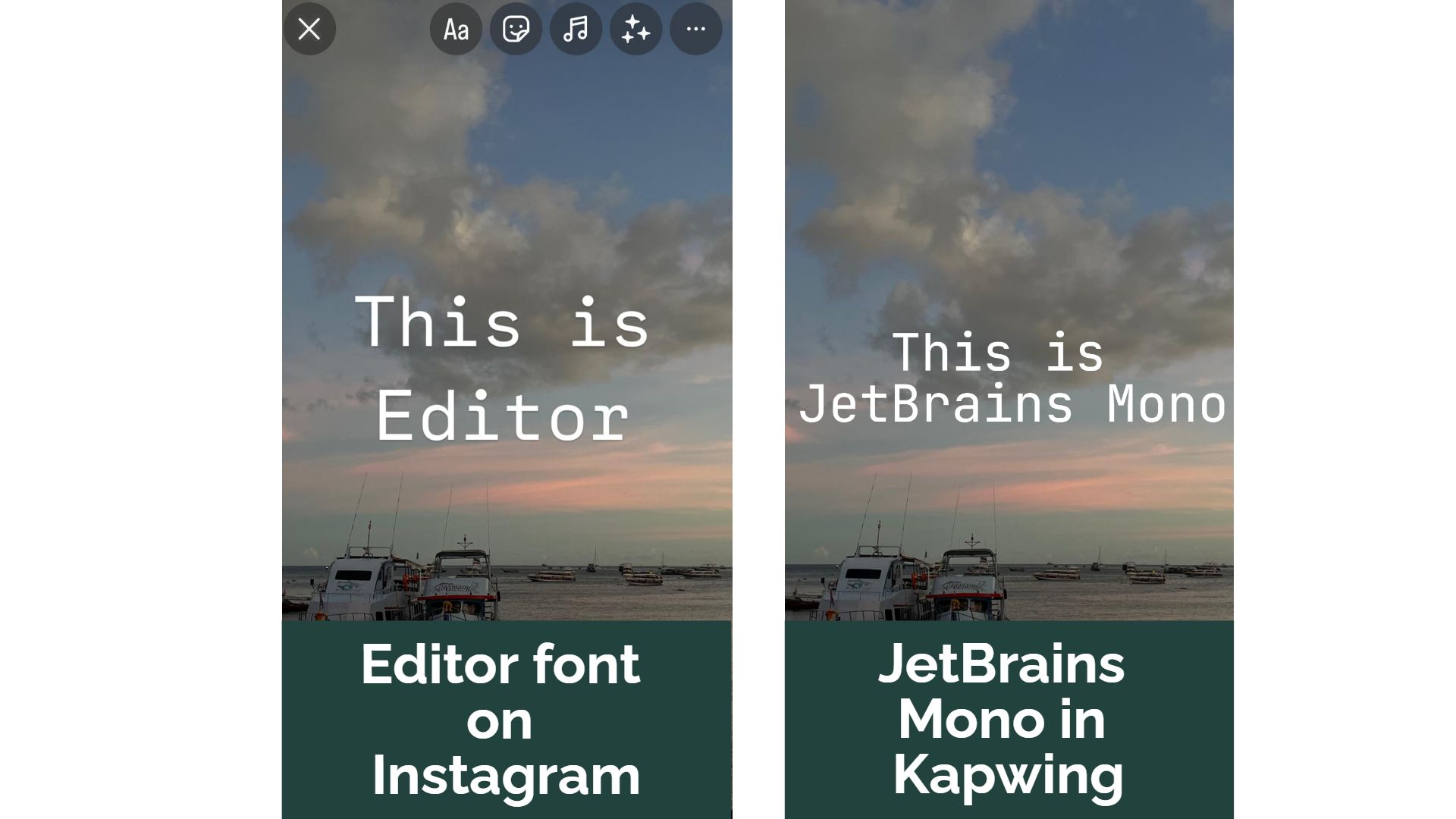
Editor
- Google alternative: JetBrains Mono — A retro-inspired and widely spaced font.
Bubble
- Google alternative: Coiny — A bold and playful typeface with rounded edges.
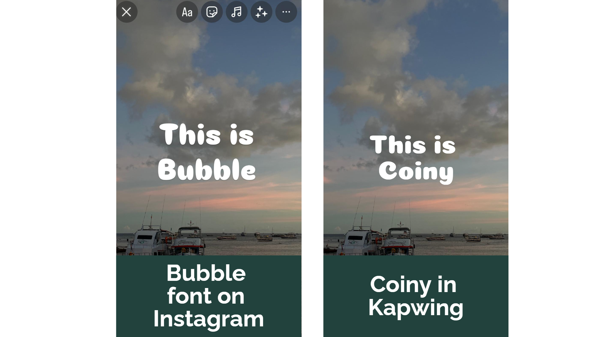
Deco
- Google alternative: Quicksand — A modern font with a clean and confident look.
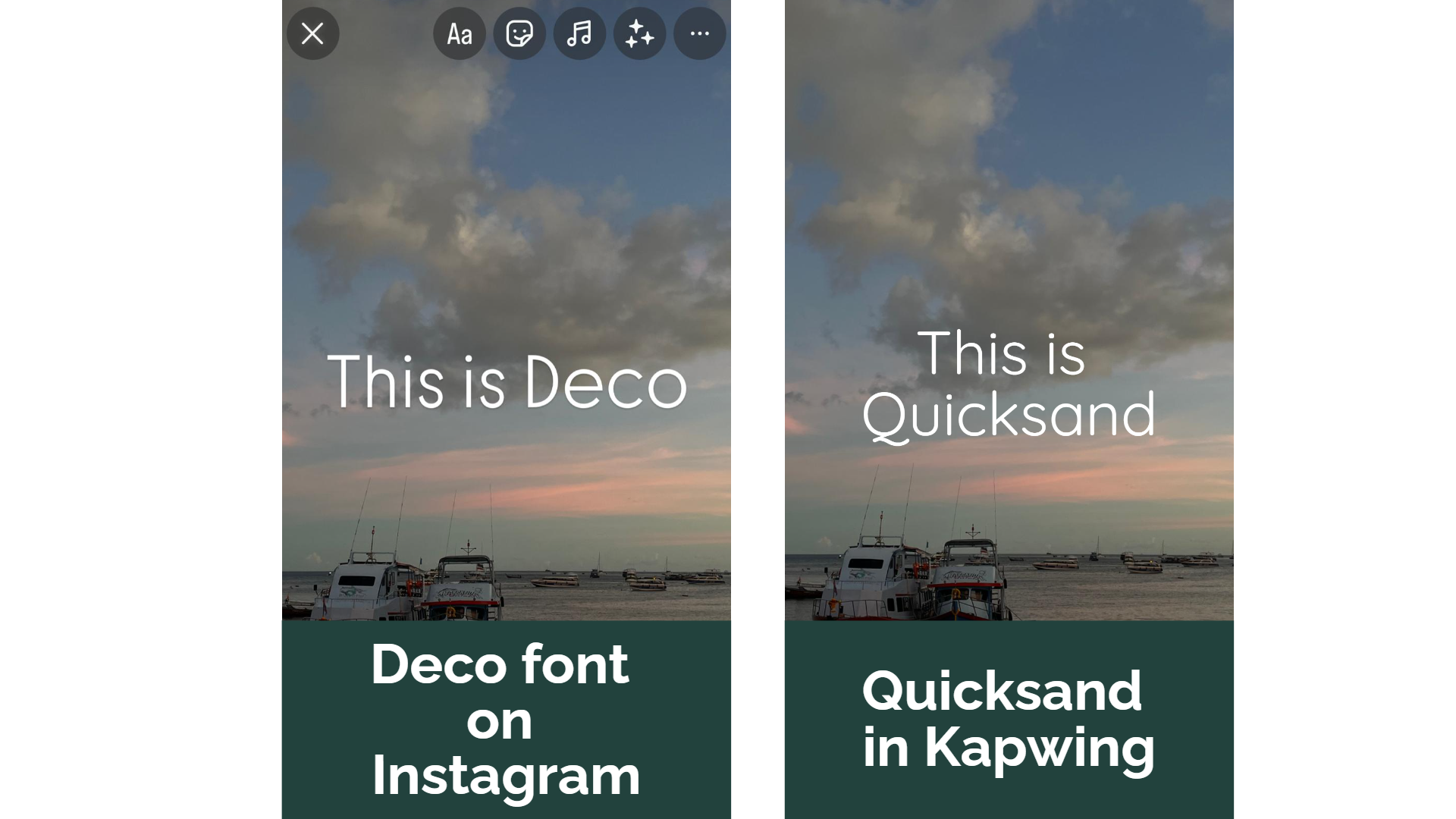
Poster
- Google alternative: Gravitas One — A striking, bold serif font designed to make a statement.
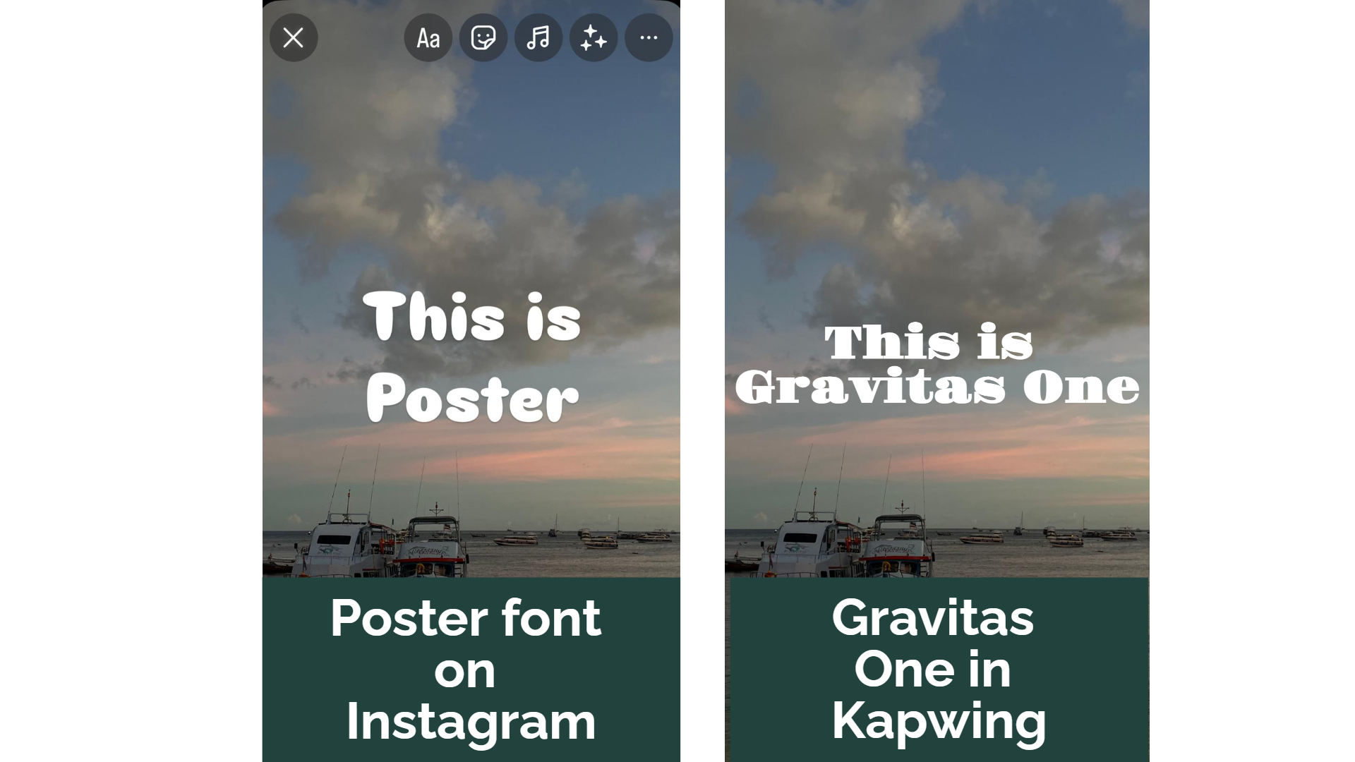
Squeeze
- Google alternative: Fjalla One — A slick, sans serif, bold font designed for short, impactful captions.
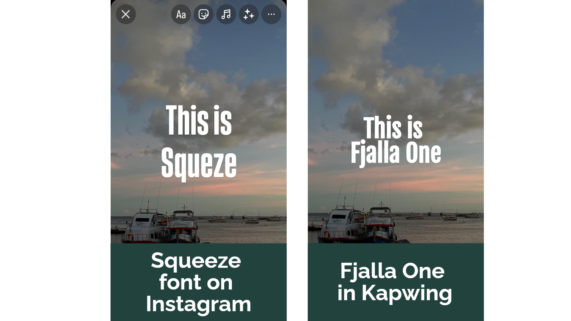
A side-by-side written comparison of each of the seven fonts with their Google alternative:

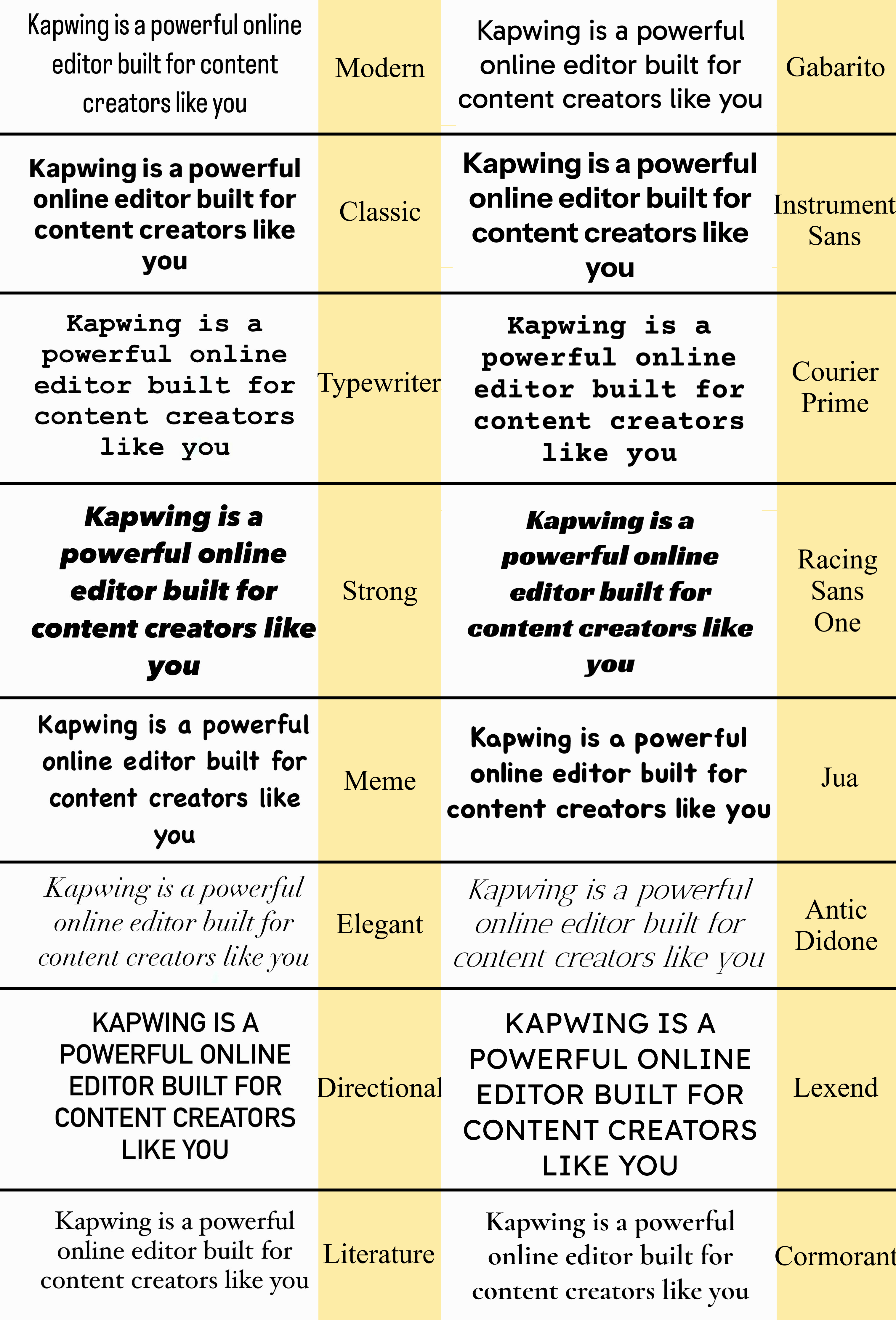
In addition to Instagram’s new fonts, here’s a comparison of the platform’s existing fonts with similar Google Fonts options to help you maintain consistency across your designs.
- Modern: Substitute with Gabarito
- Classic: Substitute with Instrument Sans
- Typewriter: Substitute with Courier Prime
- Strong: Substitute with Racing Sans One
- Elegant: Substitute with Antic Didone
- Directional: Substitute with Lexend
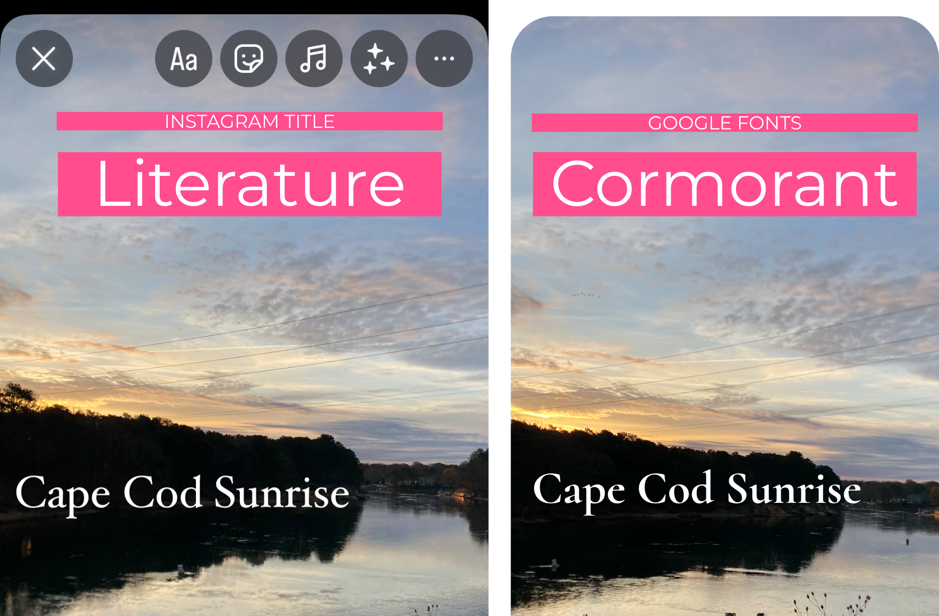
- Literature: Substitute with Cormorant
Combining Google Fonts and Kapwing For Unified Branding
Kapwing supports all Google Fonts, including those that closely resemble Instagram's new font styles. This offers content creators a seamless way to maintain consistent brand messaging, style, and tone across multiple platforms.
Instead, can unify your brand's appearance across YouTube, X, Facebook, TikTok, LinkedIn, and more by using our online Editor for free.
Simply search for the Google Font style that aligns with your Instagram font directly in Kapwing's "text" section. You can even save the font to a Brand Kit (you can add colors, watermarks, and logos, too) and apply the same style to every future project effortlessly.
Best of all, Kapwing's AI-powered image and video resizing tools automatically adapt your content to fit different social media aspects. Repurposing content while maintaining a cohesive brand identity has never been easier!
Example of Kapwing's resize tool from YouTube to TikTok
Which Font to Use On Instagram
Poster stands out as a likely community favorite. Its bold contrast and exceptional readability make it versatile for various content types and users. While it leans more neutral compared to some of the other fonts, it still adds a distinctive touch that can elevate any post's visual appeal.
Strong and Literature are also popular options among creators for their legible, simple sans typeface. As the default option, Modern is the easiest and most commonly used font.
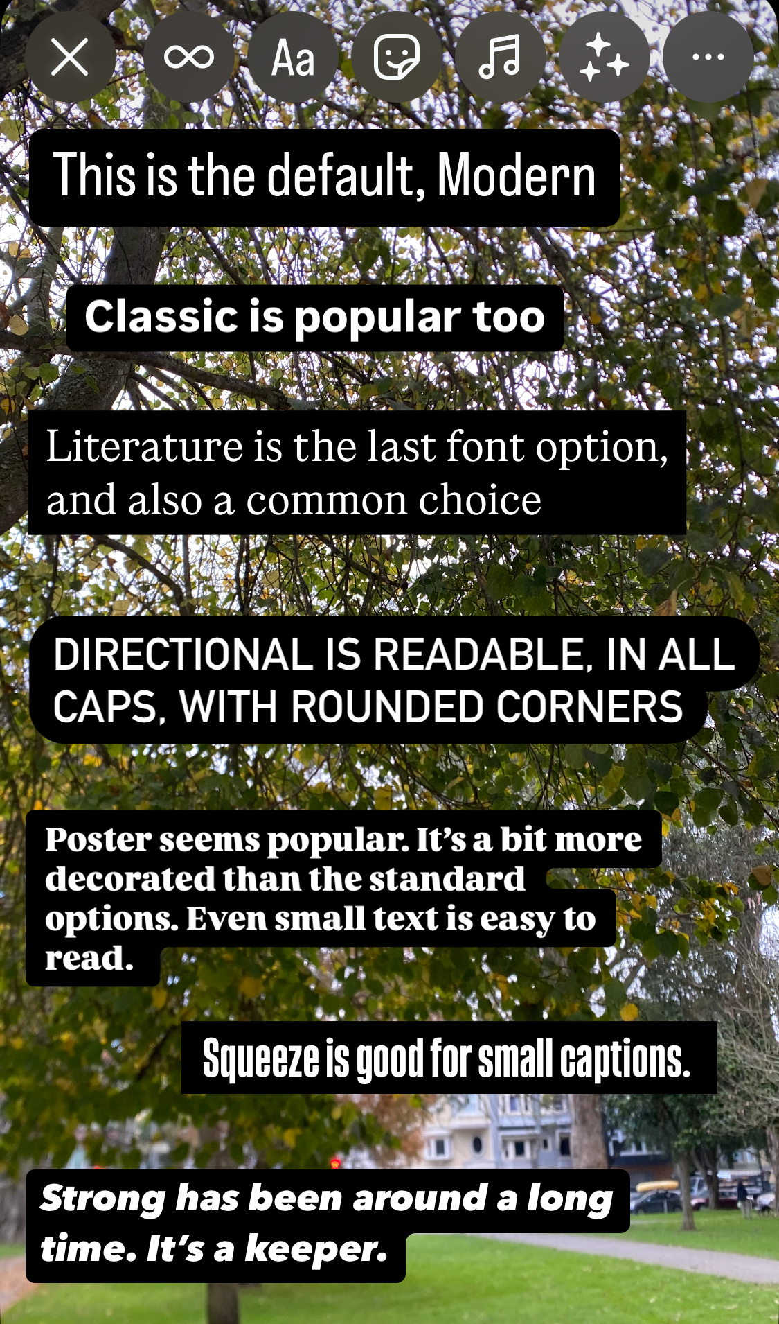
Details like these are important to consider when designing the layers in your content.
For instance, fonts like Editor require more space to make an impact, while options like Signature can fit more easily in different layouts.
How to Edit Text on Instagram
Once you've added a text layer, customize your text with Instagram's other embedded styling tools. Working from left to right, let's explore what each of these tools does:
- Font Size Slider: Adjust the size of your text by sliding the adjuster up or down to proportionally resize it.
- Font Menu: Access any of the 14 available fonts in Instagram's editor and switch between them to find the perfect match for your content.
- Color Wheel: Customize text color with tools like a color sampler, preset swatches, and a suggested scheme based on your media’s colors, ensuring your text complements your design.
- Animation Menu: Add visual flair with text animations that control how your words appear on screen.
- Text Effects: Enhance your text with additional visual details. When layered with the right font and animation, these effects can elevate your post’s production value and make it unforgettable.
- Text Alignment: Toggle text alignment between left, center, and right, just like in any word processor.
- Border/Outline Option: Add a colorful outline around your text to improve visibility. Tap this option repeatedly to cycle through the available styles and choose the one that works best.
New Animations and Text Effects
The addition of six new text animations and effects creates exciting customization possibilities for your posts. Here's a quick breakdown of how these tools can enhance your content:
Animations
- Pop: Words expand into place with a bouncy, elastic motion before disappearing, making this animation ideal for grabbing attention.
- Jump: Words hop into position and then fall away, layering well with other on-screen media to add dynamic movement.
Effects
- Sparkle: Letters shimmer with varying intensities, adding emphasis and a touch of drama to your text.
- Neon: Text glows softly, mimicking the look of an illuminated neon sign —perfect for contrasting against static backgrounds.
- Shimmer: A reflective motion glides across the text, creating the illusion of a shiny, polished surface.
- Pixel: Text takes on a pixelated appearance, offering a nostalgic, retro feel. Experiment with combining this effect with other fonts (like TikTok fonts), colors, and animations to create some truly unique graphics.
Hidden Fonts: How to Get the Papyrus on Instagram
For years, Instagram users have enjoyed the hidden Easter egg of the Papyrus font, accessible only through a few unconventional steps.
While the recent font update removed the original method to unlock it, the font hasn’t disappeared entirely. Fortunately, there’s still a secret way to bring Papyrus into your designs.
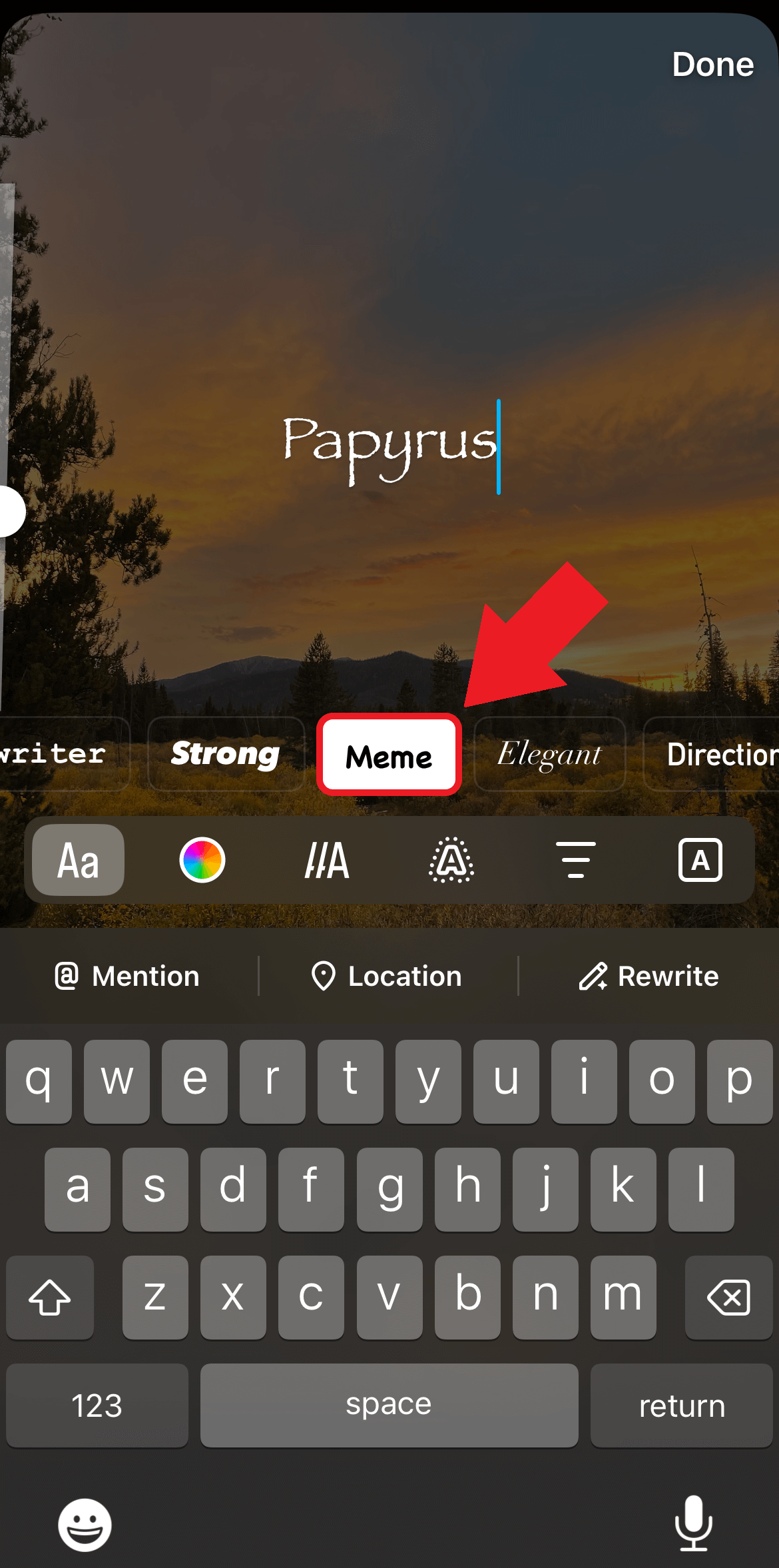
To access it, upload your chosen media and navigate to the Meme font from the menu. After selecting it, simply type the word “papyrus” anywhere on the screen. Like magic, the text will transform into the Papyrus font, letting you add this unique element to your content.
While finding hidden features like this is exciting, what’s even more rewarding is having access to tools that elevate your creative process.
Kapwing supports a variety of fonts built into the editor, with the ability to also upload fonts, and is an all-in-one editor you can use to upload, create, and convert content.
With editing tools and AI features that streamline efficiency and boost creativity, Kapwing empowers you to create standout content that’s as unique and memorable as the Papyrus font itself.

