Landscape vs Portrait — Tips from a Freelance Photographer
What orientation should you be using for your next photoshoot?

As an experienced freelance photographer and certified iStock contributor, I understand the creative freedom that comes with planning a photoshoot, capturing still moments in time, and sharing them on social media. Throughout this process, many small details often go unnoticed. Whether selecting the right equipment, editing your photos, or ensuring they are properly sized for varied projects, these finer details can significantly impact the overall quality and professionalism of your work.
For business owners, content creators, and teams working on marketing materials, these details are especially important. Choosing the right orientation — landscape or portrait — plays a key role in making your visuals stand out. Understanding when to use each will ensure your work always looks professional.
In this article, we'll explore the differences between landscape and portrait images, key factors to consider when planning your shoot, and how to adjust images if they were captured in the wrong orientation.
Table of Contents
- Landscape vs Portrait
- When to Pick Portrait or Landscape
- Orientation Tips and Tricks (Advanced)
- How to Resize Landscape and Portrait Images
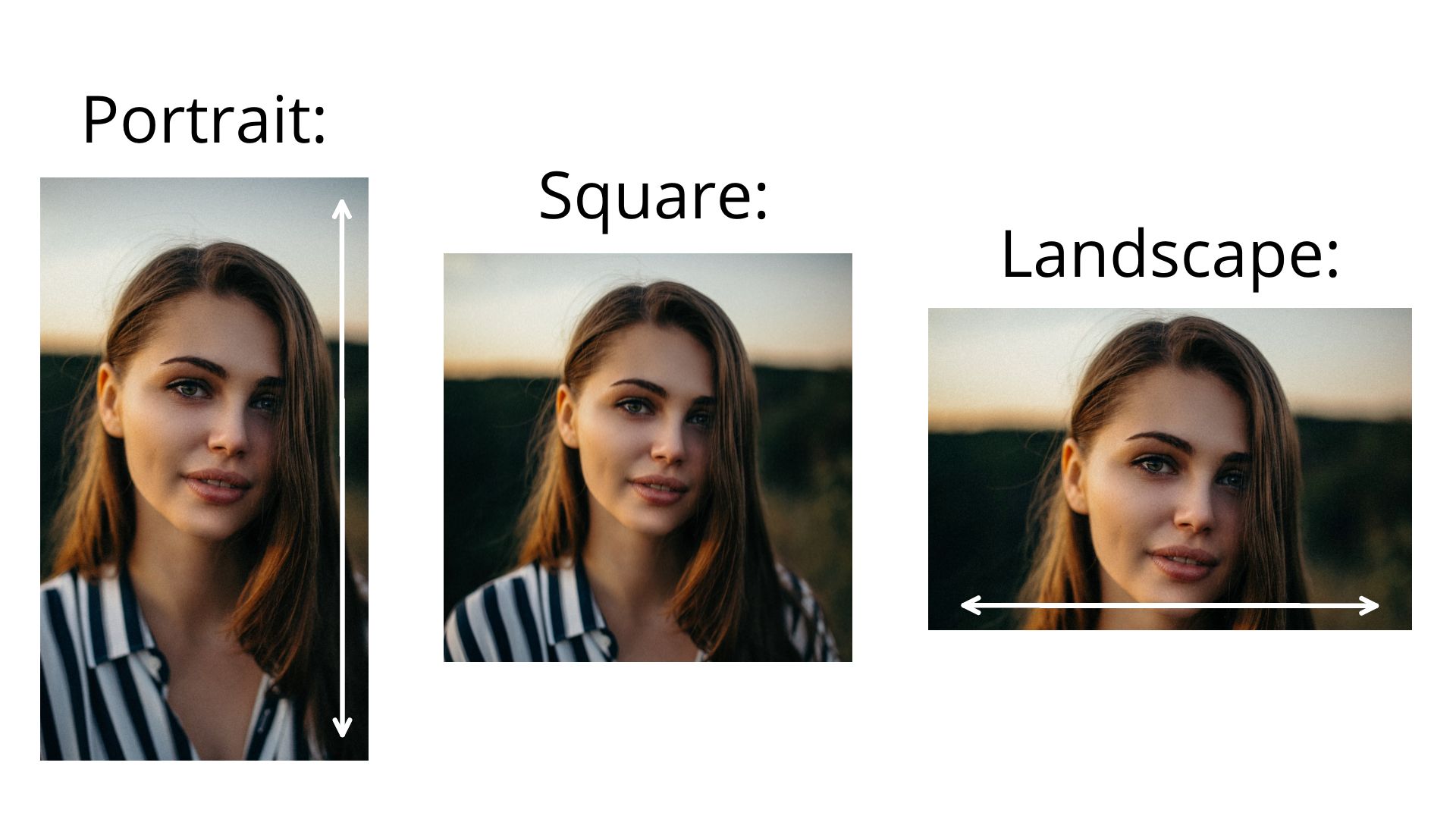
Landscape vs Portrait
The orientation of an image is determined by whether it is taller than it is wide or wider than it is tall. This is easiest to understand when comparing portrait and landscape images to a square.
Landscape images are wider than they are tall, while portrait images are the opposite. Since multiple aspect ratios fall under these orientations.
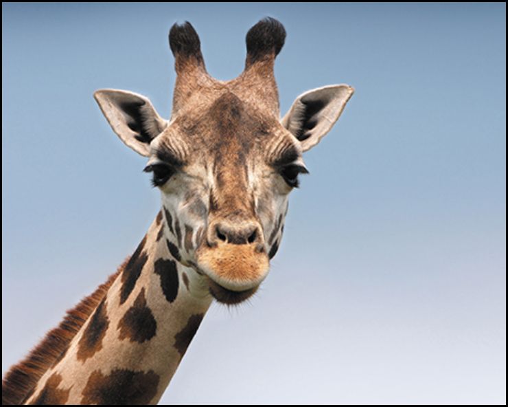
- Landscape images (typically 3:2 or 4:3 on mobile devices) are designed to capture wider scenes with greater depth, often with less emphasis on individual details.
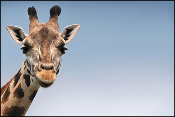
- Portrait images (typically 2:3 or 3:4 on mobile devices) are usually designed to focus on a single subject with greater detail. This format is often used for headshots or other images where the subject is central and the background is less prominent.
When to Pick Portrait or Landscape
Understanding the difference between portrait and landscape orientations is important, but knowing when to use each one is key.
The right choice depends on your content type and how it will be viewed. Portrait orientation is typically better for vertical content like social media videos, professional headshots, and printed posters. Landscape orientation is ideal for widescreen videos, presentations, and photography that captures broader scenes.
Below are the most common aspect ratios for each and their best use cases.
Portrait Aspect Ratios:
8.5:11 – This aspect ratio matches standard printer paper, making it common for documents, homemade posters, and flyers. It’s ideal for printed materials you plan to distribute in large quantities, such as promotional posters or infographics.
9:16 – The 9:16 ratio is the standard for mobile-optimized content. Platforms like TikTok, Instagram Reels, and YouTube Shorts use this aspect ratio because it fills the entire screen on mobile devices without cropping. If you're creating content for a mobile-first audience, this is the best option.
2:3 – This is the standard portrait aspect ratio for professional photography. DSLR and mirrorless cameras capture images in a 3:2 ratio by default, meaning photos taken vertically will appear in a 2:3 portrait orientation. This aspect ratio is ideal for headshots, professional portraits, or photos that document important business events.
4:5 – The 4:5 ratio is common for printed materials and social media posts. It’s a popular option for Instagram photos since it maximizes screen space without forcing users to scroll too much.
Landscape Aspect Ratios:
11:8.5 – As you might have expected, many of the most common landscape aspect ratios are simply the inverses of their portrait counterparts. This is the aspect ratio of printer paper, common for digital certificates, documents, and homemade posters using a horizontal layout.
16:9 – The 16:9 landscape aspect ratio is one of the most widely used formats for digital content. It’s the standard for widescreen videos on platforms like YouTube and is ideal for presentations displayed on large screens, such as conference room TVs. If you're creating video content, marketing slides, or tutorials designed for desktop viewing, this is the best landscape aspect ratio to use.
16:10 – Less common but still important, this ratio is standard for Apple laptop screens. While it doesn't restrict other aspect ratios from displaying properly, it’s useful when designing wallpapers or screensavers specifically for Apple devices.
3:2 – Just like its portrait counterpart, the 3:2 landscape aspect ratio is the default for most professional cameras. Capturing horizontal images in this format is ideal for landscape photography, group shots, or any photo intended to capture wide scenes with natural balance.
5:4 – The 5:4 landscape aspect ratio is often used for printed images. Since it displays slightly taller on most devices by cropping the edges, it’s commonly chosen for framed prints or wall art where visual impact is more important than screen optimization.
Orientation Tips and Tricks (Advanced)
For photography, several effective techniques can improve your photos and make them more engaging. These methods apply to both portrait and landscape shots, though some work better in certain orientations. Combining multiple techniques can enhance your overall image.
Framing
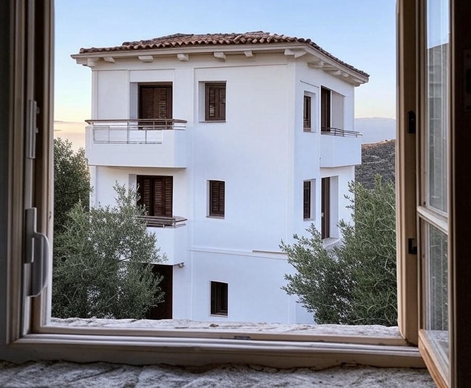
Framing involves using elements within your scene — such as doorways, windows, or tree branches — to create a natural border around your subject. This technique creates emphasis by adding depth using objects in the foreground. While this technique is less important for portrait photos, it can greatly enhance landscape images by adding a stronger sense of balance and completeness.
For travel influencers and content creators on the go, framing is a powerful technique for capturing engaging establishing shots in both photo and video. By positioning a central subject — such as a building or landmark — within a defined frame, you naturally draw the viewer’s attention to it more effectively than if it stood alone in the shot. This approach not only guides focus but also adds depth and visual interest to your content.
Balancing Images Using the Rule of Thirds
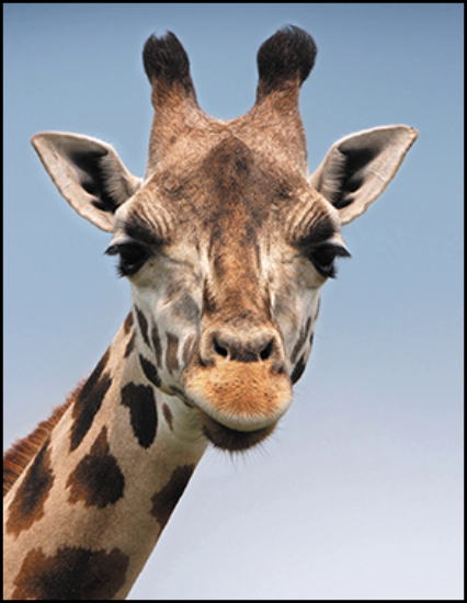
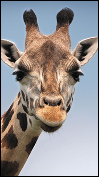
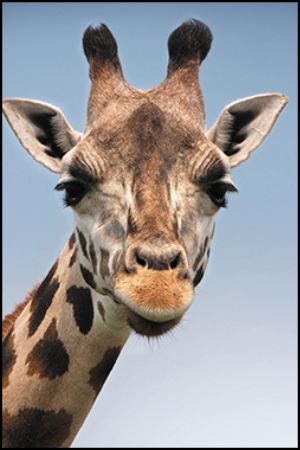
The grid overlay on your camera or phone is more useful than you might think. It’s designed to help you follow the rule of thirds, a technique that improves image balance by positioning subjects along the grid lines or their intersections.
For landscape images, aligning the horizon with the top horizontal grid line can improve visual balance. As shown in the example below, placing the horizon slightly above the grid line can make the sky appear too small, while aligning it properly creates a more proportional scene.
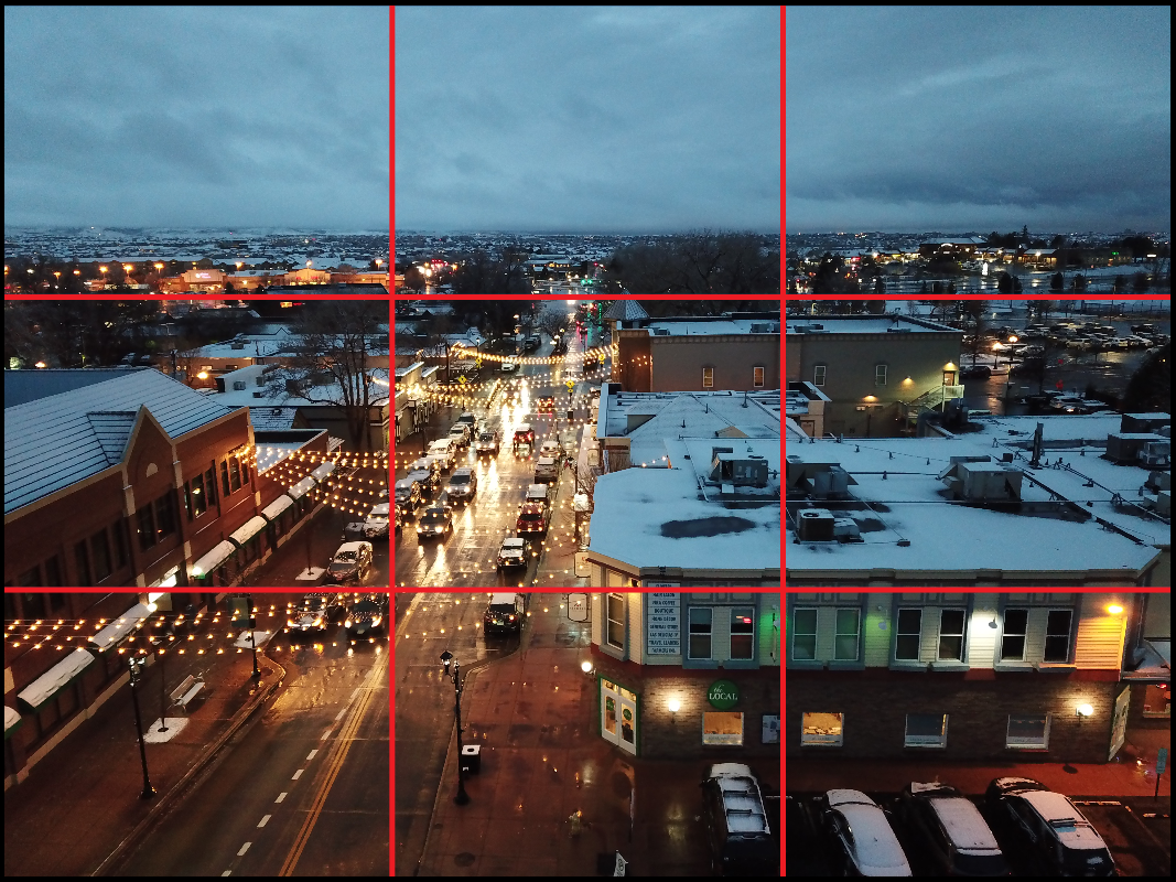
In portrait images — including posters and other vertical designs — placing key details at grid intersections can make your composition more engaging. This technique draws attention to important elements and creates a sense of balance throughout the image.
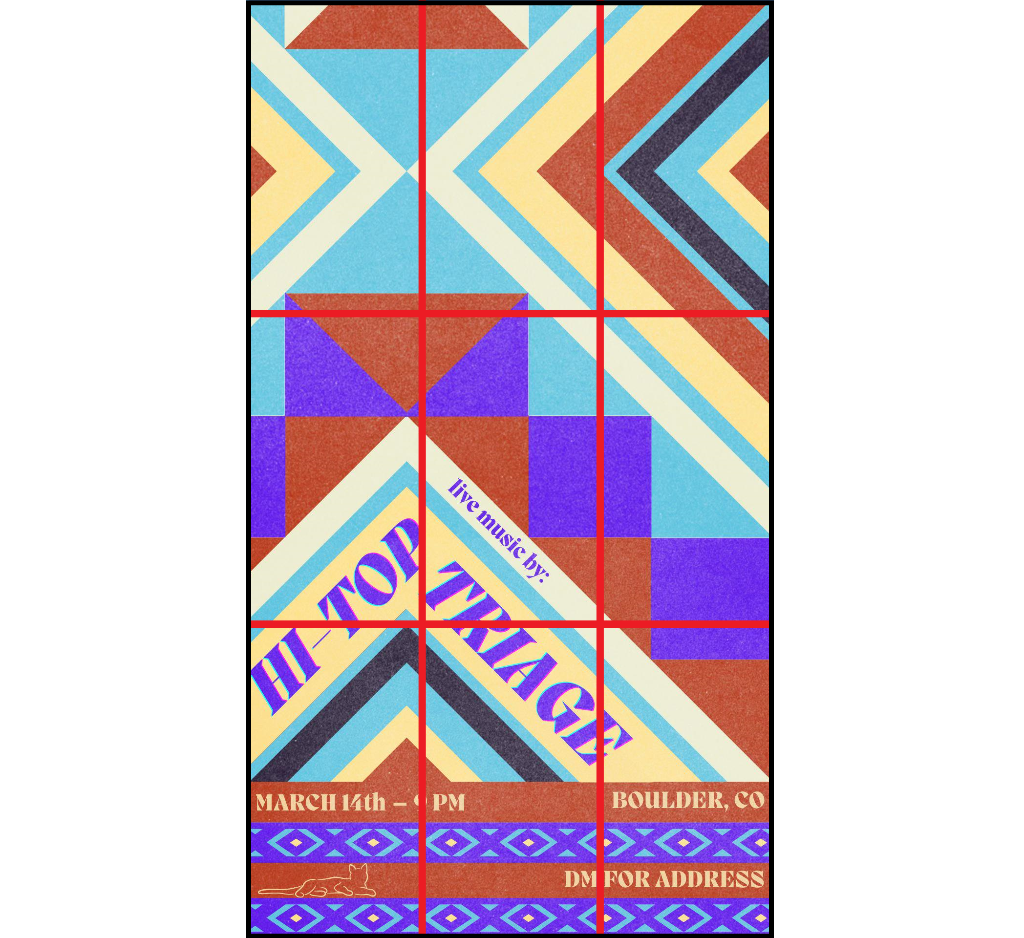
In the event that you capture a photo that doesn’t follow the rule of thirds, consider cropping your image to experiment with different subject placements. Adjusting the crop can help reposition your subject along a grid intersection for a more balanced and visually appealing composition.
Lighting
Lighting is especially important when capturing professional images like headshots for LinkedIn profiles and website staff sections, alongside product demo photoshoots for marketing or advertising efforts.
For portraits, backlighting is generally avoided unless used intentionally as a stylistic choice. Instead, subjects should be illuminated from the front (and sides, if possible) to capture more detail. Backlit portraits often result in images with reduced clarity and contrast. To better understand the impact of lighting, refer to these three examples showcasing front lighting, side lighting, and backlighting.
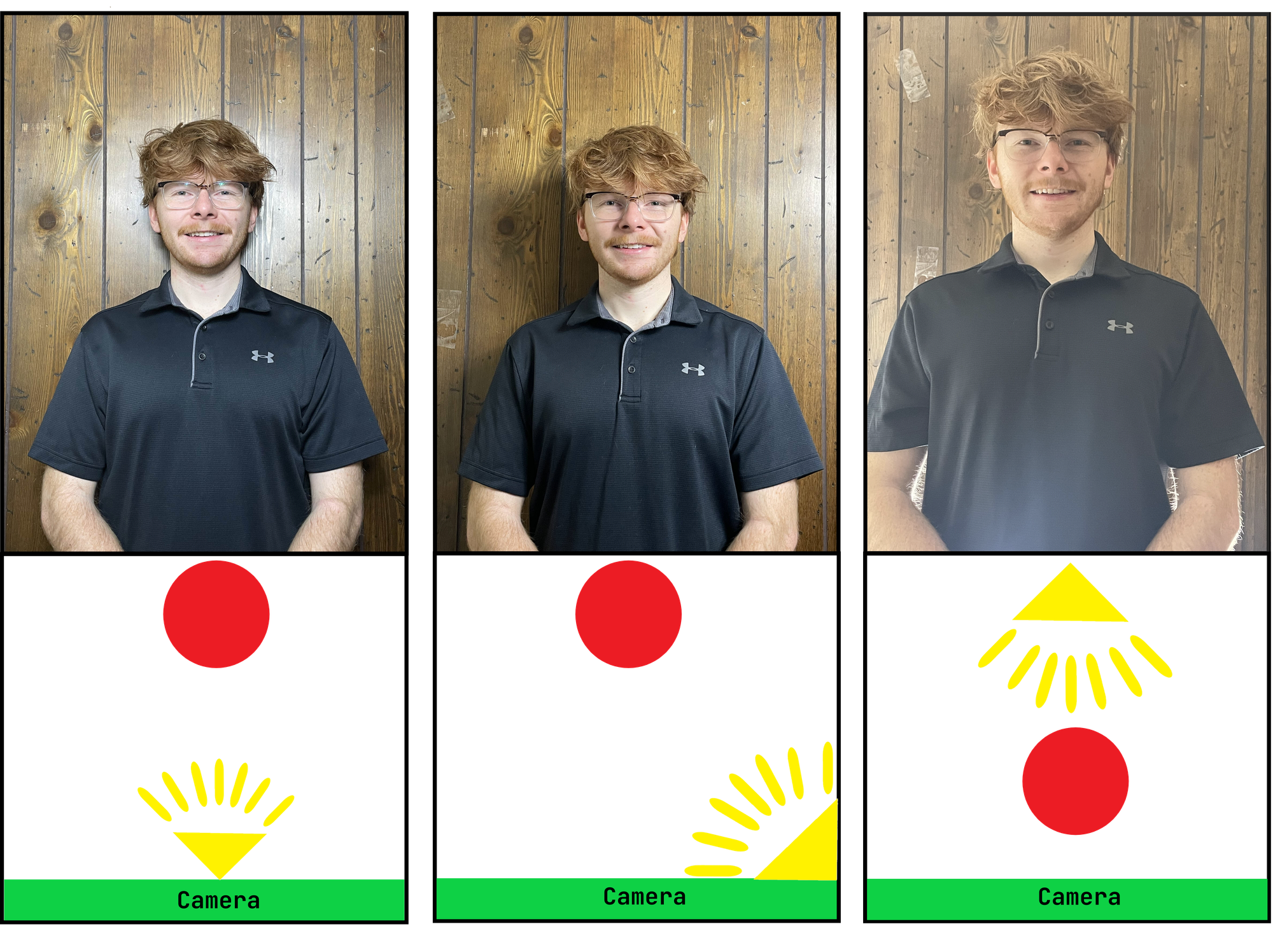
If you capture an image with poor lighting that results in lower quality, consider using an automatic image enhancer to improve the resolution. While lighting issues can affect image quality, enhancing the photo afterward can help ensure important details remain visible.
How to Resize Landscape and Portrait Images
The way you present your photos is nearly as important as the photos themselves. Even with careful planning, capturing, and editing, poor optimization can limit your image’s reach.
For platform-specific sharing, resizing is often the best solution for improving visibility. Square images are easiest to resize since they can be cropped or extended using AI to fit other orientations.
Converting vertical images to horizontal (or vice versa) is often more challenging. In the event you need to resize an image later, Kapwing makes it easy to do so with over 15 preset aspect ratio templates. To resize an image on Kapwing:
1. Upload Your Image
Start by uploading your image to the Kapwing editor.
2. Open the Resize Project Tool
Select the background of your project, then navigate to the tools menu on the right-hand side to access the Resize Project tool.
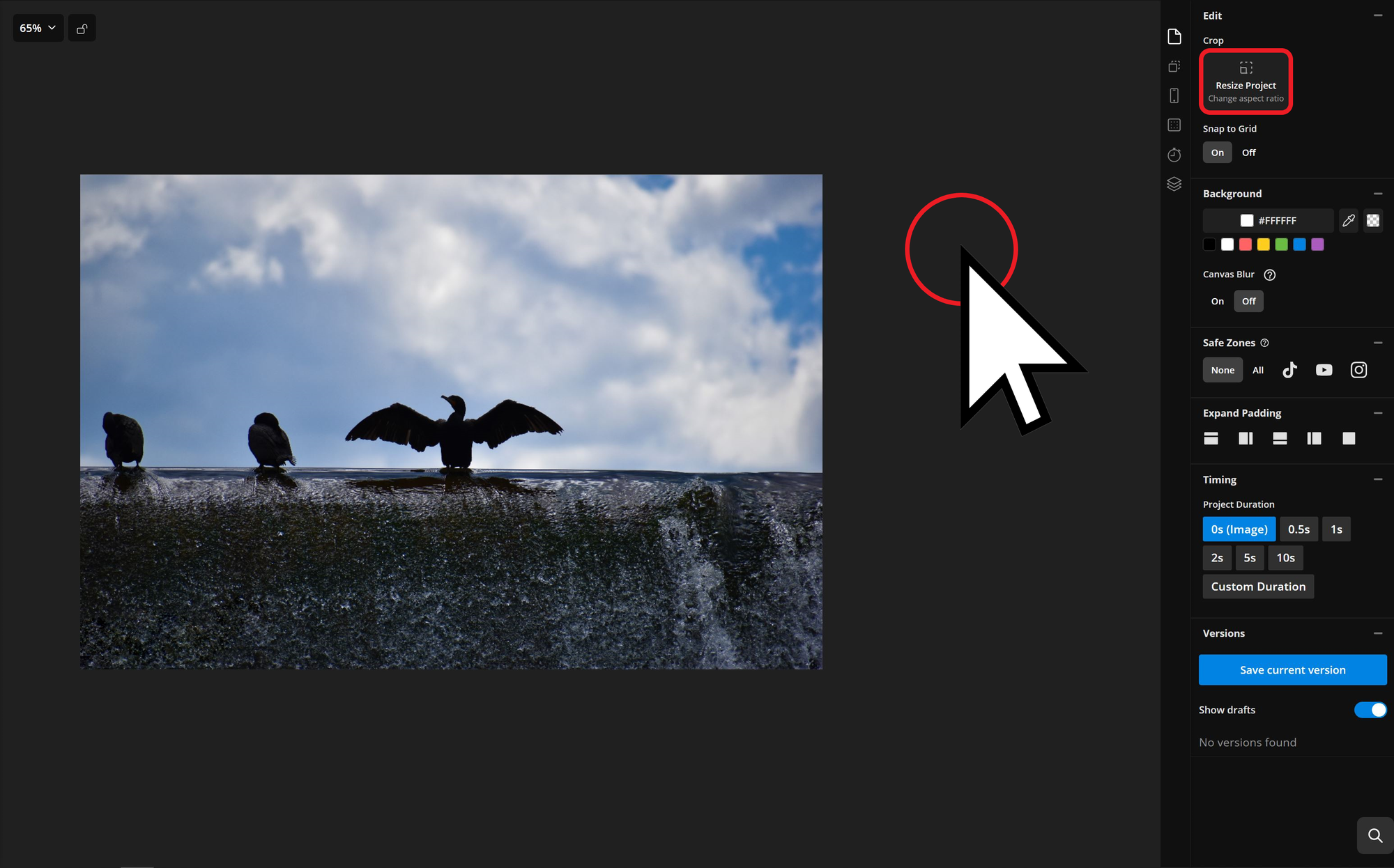
3. Resize Your Image
Use the Size dropdown to choose from the available presets or enter custom dimensions.
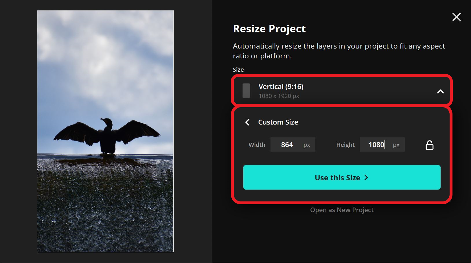
Here are some common resolutions for resizing images:
- 2:3 – 1000 x 1500 pixels
- 4:3 – 1440 x 1080 pixels
- 4:5 – 864 x 1080 pixels
- 16:9 – 1920 x 1080 pixels
These dimensions can be reversed for portrait or landscape use.
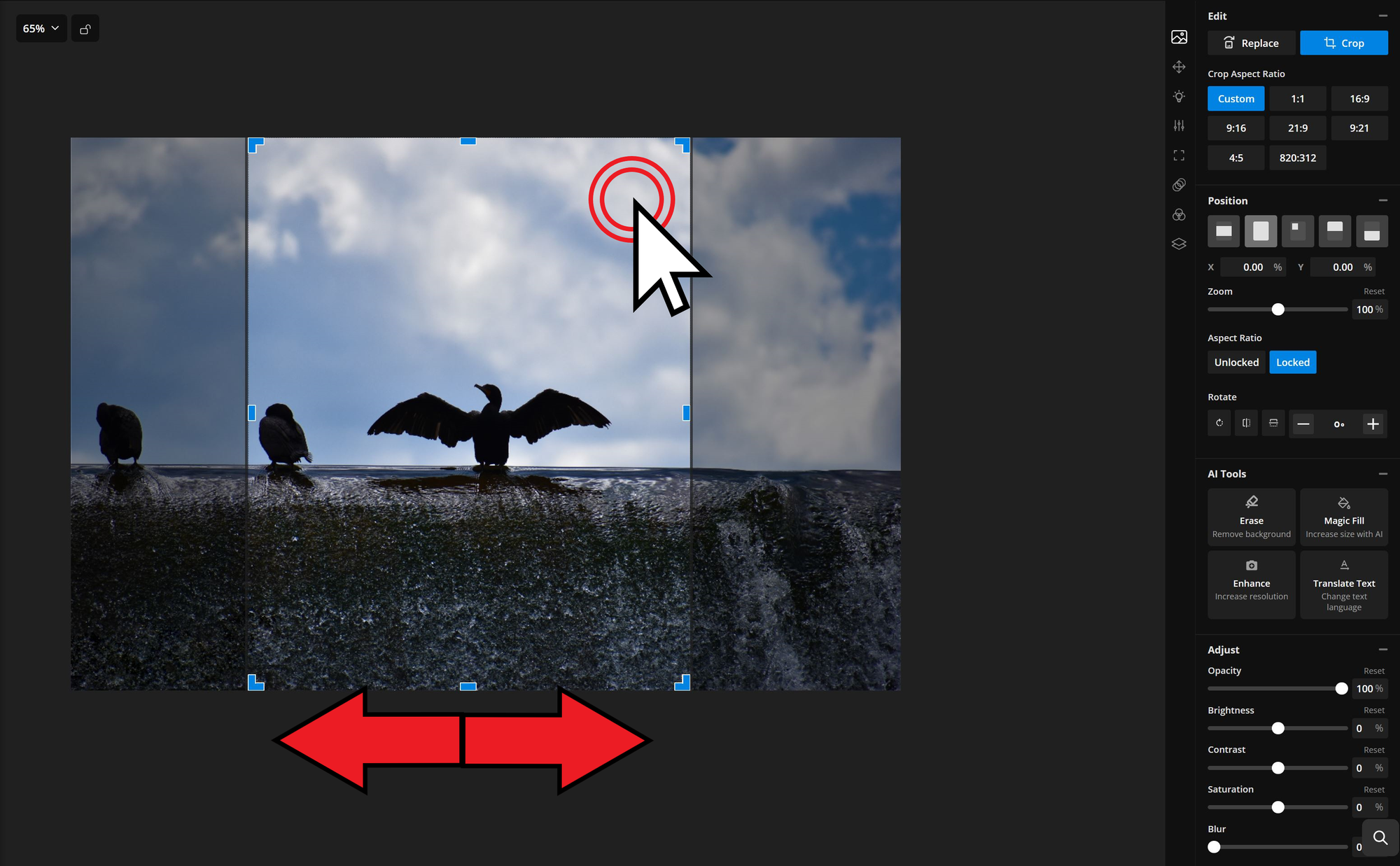
4. Crop Your Image (Optional)
After resizing, you may want to crop your image to adjust its framing. Double-click the image, then drag it within the frame to reposition it.
Your resized image is now ready to be exported and shared.


