How to Make Your Own Logo Online
Logos are an important of your branding for your team, company, product, or even yourself. I'll give you some tips & tools for creating your own logo for free online.

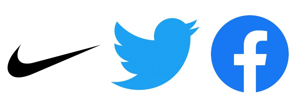
Logos are small graphic elements that can represent a team, brand, movement, product, even just an individual. Logos allow these brands, people, or products to gain recognition, identity, and familiarity. The best logos are distinctive and simple: the Nike swoosh, the Twitter bird, the Facebook F.

Of course, these companies spend a ton of money on their logo design, but what if you want to make your own custom logo for your personal brand, company, team, or project? It’s actually really easy to do, and can take just a couple minutes. Here’s what you should keep in mind:
- Make it mostly square or circular
- Don’t use photos or many different colors
- No need to get clever – just make it look nice
- Make it transparent
- Speed up your design process with Kapwing
1. Make it mostly square or circular:
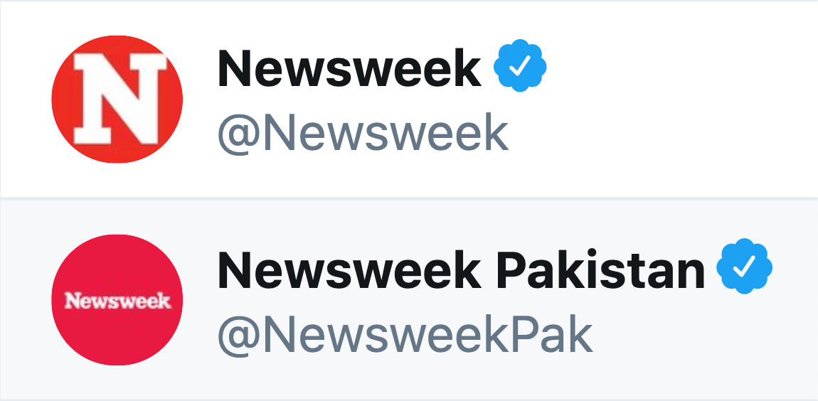
If your logo were only used on physical signs, papers, or merchandise, it could be as wide or as tall as you want. But that’s most likely not the case. Today, you’ll certainly need to use your logo on your website, online content, and social media profiles. And in most cases online, logos and avatars need to be square or circular. Brands with wide logos can have trouble making their images large enough to be legible in a square or circular format, and most social media and job posting sites require square or circular avatar formatting. Here's a clear example of why shorter logos look best in square and round formats:

Luckily, it’s simple to make your logo recognizable with square or circular dimensions. If the name of your brand is longer than 6 or 7 letters, just leave it out of the logo! Since the logo will almost always be used in places with your group’s name – social media accounts, for example, will always have your page name included wherever your logo is visible – your logo can be purely graphic, with no words or names involved. Or it can simply be a stylized version of the first letter, like Newsweek's "N" above.
2. Don’t use photos or many different colors:
One of the main benefits of a personal or brand logo is versatility – a simple, recognizable logo can be used everywhere from an internet ad to a branded t-shirt. But this also presents some difficulty: if you want to use your logo as a watermark or printed design, or be able to use it in colorful graphics, you shouldn’t use a photo, or use too many different colors in your logo.
For printed uses or watermarks, vector images and png files are better, with transparent sections and simple contrast to allow your logo design to fit seamlessly into any background and look good in black & white. And if your logo only uses a couple distinct colors, then it will avoid clashing with other images and designs, and its colorway will be easy to associate with your brand.
3. No need to get clever – just make it look nice

What do these 4 logo have in common? They have absolutely nothing to do with the companies they represent, or what services they offer. But they're appealing and recognizable nonetheless.
You might think that your logo should tell people something about what your company or brand does, or include some sort of imagery related to what you do. Most of the logos you know best have nothing to do with what their business does: some merely represent a name, or part of one (CNN, Facebook, Tumblr, Amazon), some are graphic representations of a name (Twitter, Bumble, DropBox), and some are entirely unrelated icons (Nike, Adidas, NBC). So if, say, your brand provides scheduling support for online businesses, your logo doesn’t need calendar iconography – it’s a better idea to use part of your brand’s name, something representing the name, or just a nice-looking insignia.
4. Make it transparent
This is important for the same reason as #2 – versatility. You’ll want to be able to use your logo on pictures, videos, documents, and even merchandise. But if your logo file is a square with a solid background, it’ll look hasty and unprofessional wherever you use it.
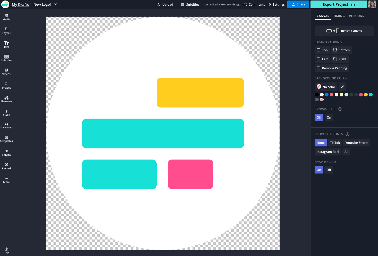
Instead, your logo should have transparent areas, so it fits in visually wherever you use it. At the very least, its background should be cropped to a circle, so it interrupts pictures and videos as little as possible. Use the "Erase" tool in Kapwing to remove the background from your logo.

5. Speed up your design process with Kapwing
There are plenty of online tools that allow you to create custom logos, with varying degrees of customization. Canva offers a polished UI with a lot of cool templates to work with, but it doesn’t give any options for uploads from the web, and it doesn’t allow you to process images with any transparency without paying for a Canva Pro account, so your logo can only be created with a solid background.
I prefer using Kapwing to make vector icons, logos, and watermarks. It allows universal web uploads from anywhere, so you can easily find PNG and vector images to start creating your logo. Plus, it allows you to make your background fully transparent for free, so you can add it to any picture, video, or document you want, without leaving a solid square background behind it.

Remember to tag us @KapwingApp whenever you share your content on social media– we love to see what our creators are passionate about! And be sure to subscribe to the Kapwing Resources page – we’re constantly writing new tutorial and features to help you make the most out of Kapwing.
Related Articles:


