How to Get CapCut Font Styles (and Best Alternatives)
Custom font styles are on the rise in 2025

With so much emphasis placed on creating an authentic, recognizable, and lasting brand aesthetic, it’s no surprise that choosing the right font can have a significant impact on your overall video output. While CapCut offers a wide range of fonts, many creators have begun switching to other editing platforms — either for access to more advanced features or due to concerns over a potential long-term ban.
Whatever the reason, maintaining your established visual style is key. That means using the same fonts — or the closest possible matches — across platforms.
In this article, we’ll walk you through everything you need to know about finding the exact fonts used in CapCut, identifying suitable alternatives, and adding those fonts to your images and videos with ease.
Table of Contents
- Understanding Your CapCut Font
- How to Find an Identical CapCut Font
- How to Find Similar CapCut Font Styles
- The Best Alternatives to Popular CapCut Fonts
- Choosing the Right Font for Images and Videos
Understanding Your CapCut Font
Fonts are highly visual by nature, so it makes sense that comparing and identifying them is just as much a visual process. While typeface anatomy can get complex, you can usually narrow things down by focusing on a few key features.
Take the popular Brat font, for example. It stands out due to several distinctive design elements worth noting:
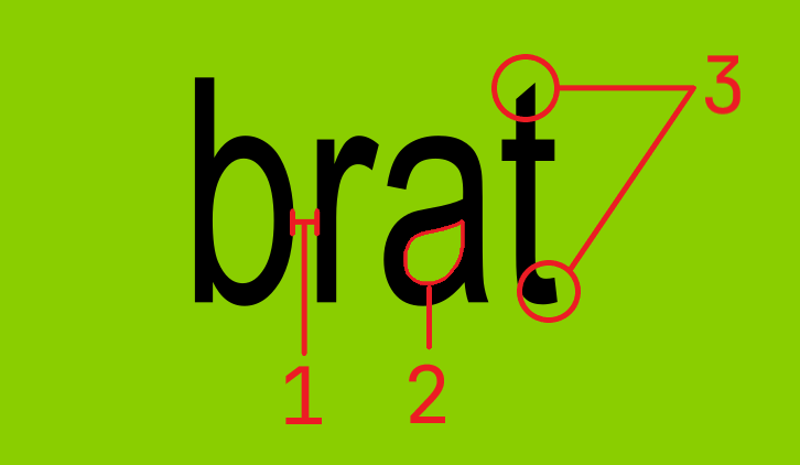
- Letter spacing is uniform and tight.
- The area within the letters — known as the counter — has a distinct shape, especially noticeable in the letter “a,” where the space comes to a winged point in the corner.
- The ends of certain letters, such as the top and bottom of the “t,” are uniquely styled. These aren’t quite serifs, but they stand out and should be considered when looking for similar fonts.
Additionally, elements like italics and weight (how bold or light the text appears) can make a big difference in achieving a specific look and feel.
Paying attention to these subtle visual details can go a long way in helping you identify alternative CapCut fonts.
How to Find an Identical CapCut Font
Many of the fonts found in CapCut are also available in other editors, making it easy to reuse your preferred styles. Here’s how to search for a CapCut font in the Kapwing online video editor.
Start by creating or opening a project in the editor. Then, add any text by clicking and dragging, or by selecting the Add Text button at the top of the Text menu in the left-hand sidebar.
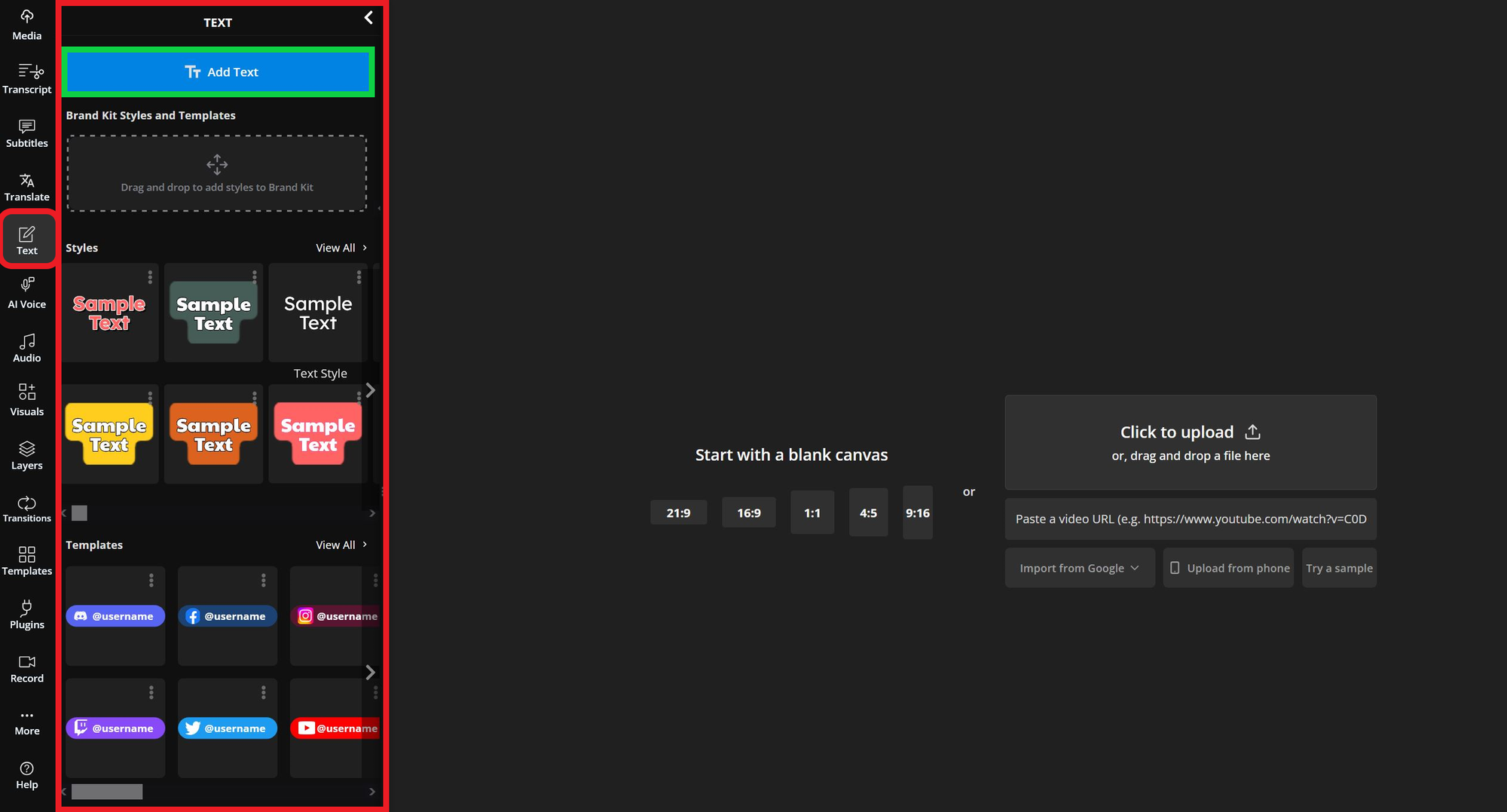
Once the text is added, select it to open the font dropdown menu. This menu appears in the editing tools on the right side of the desktop editor, or at the bottom of the screen on mobile.
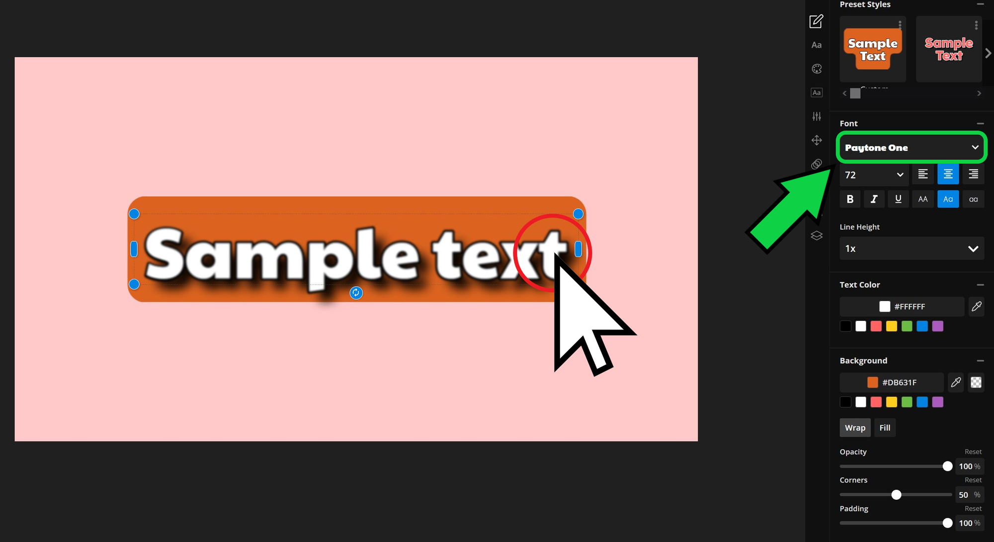
Click the dropdown menu to expand it, then select Browse All Fonts to open the full Kapwing font library.
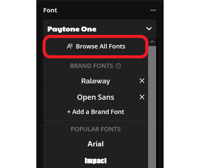
To search for a specific font, type its name in the search bar at the top of the font library (there are over 1,000 fonts on Kapwing).
You can also browse the full list by sorting it alphabetically or by popularity using the sort tools in the top right corner.
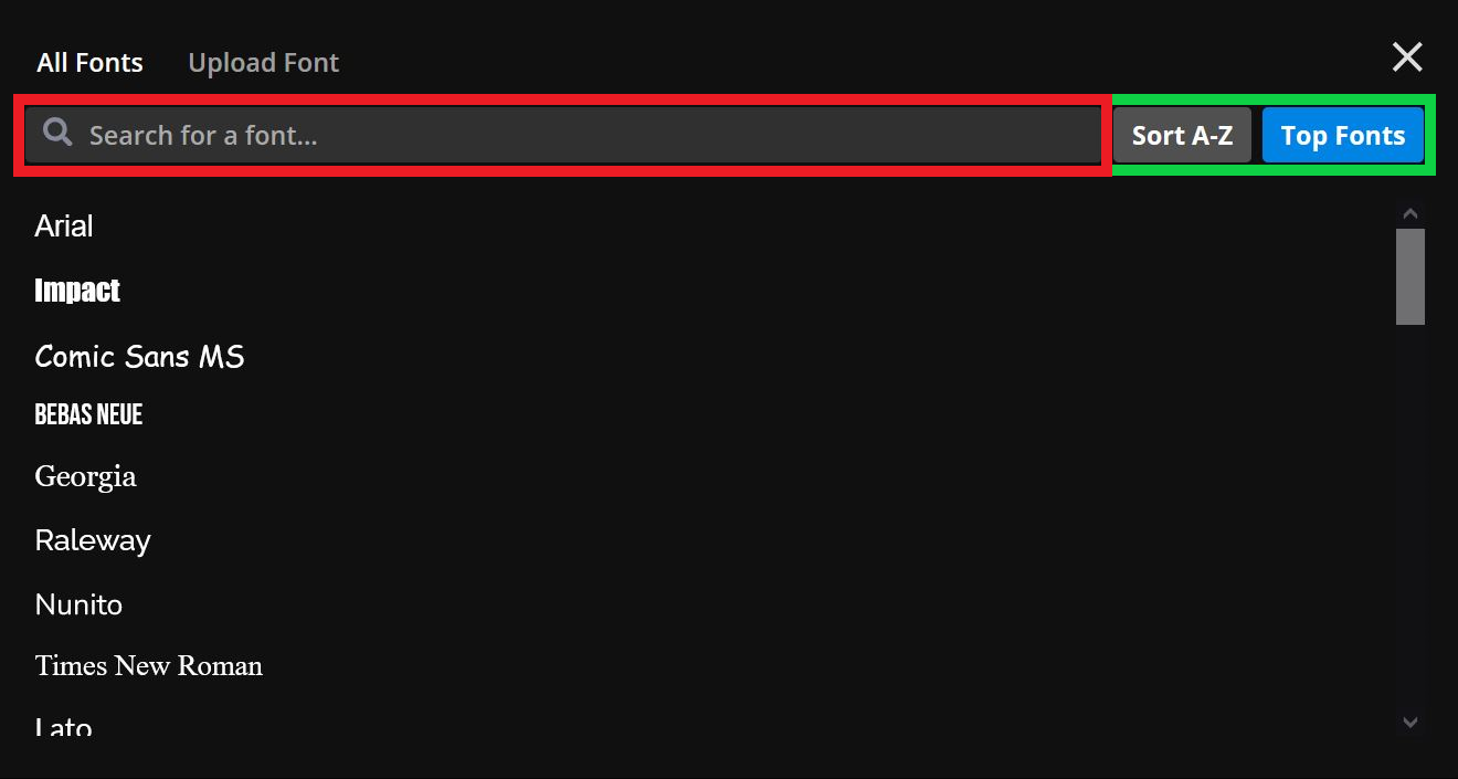
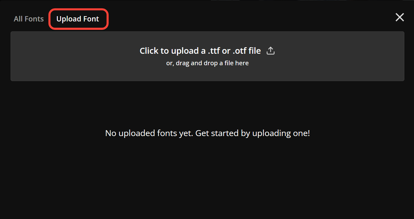
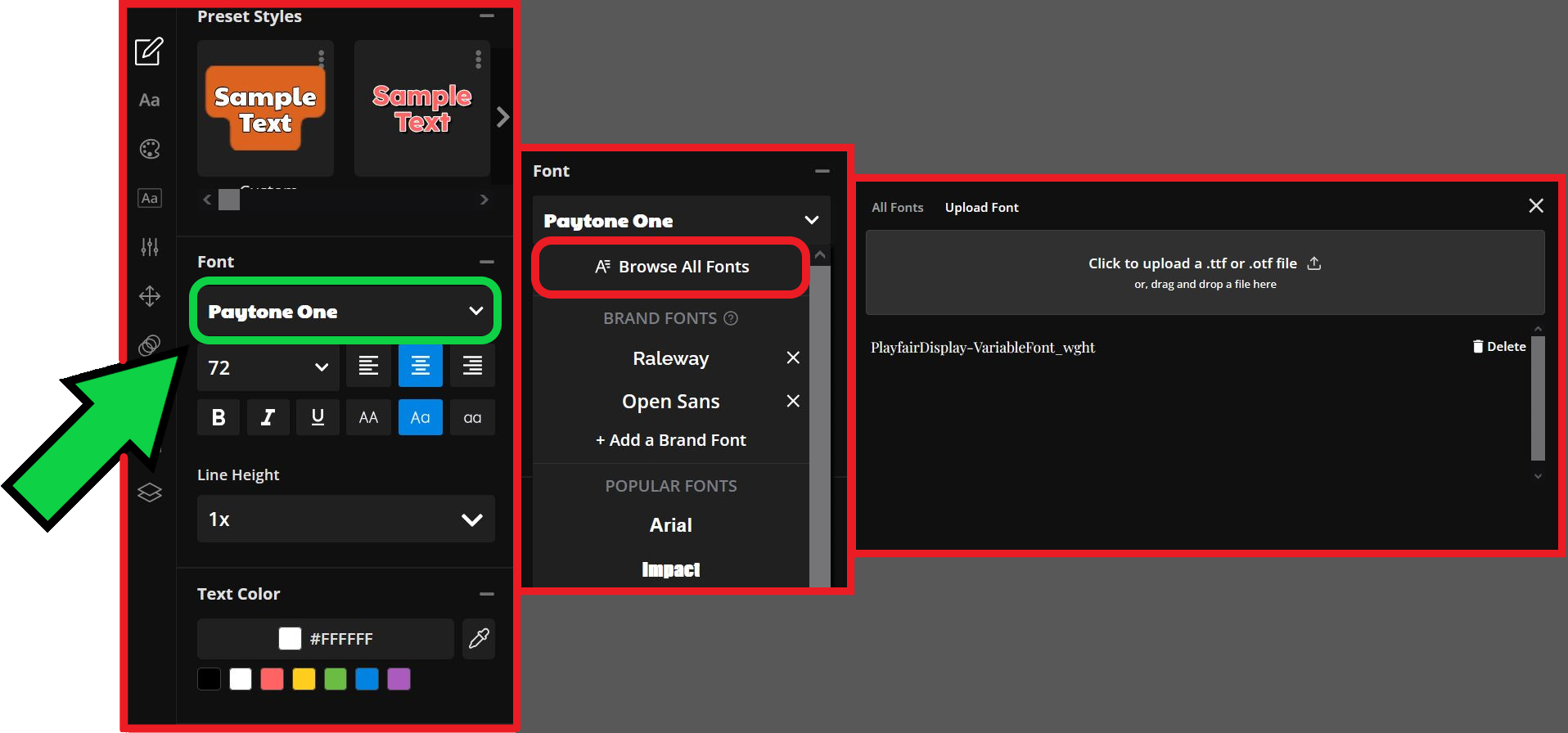
While the selection is extensive, there may be times when the exact CapCut font you’re looking for isn’t available. Instead, you can upload a custom font directly from the same screen.
To do so, select Upload Font at the top of the font library. Then, either drag and drop your file or click to browse and upload it manually.
How to Find Similar CapCut Font Styles
In my experience, combining Google Fonts with a video editor that bears a lot of similarities to CapCut is the ultimate workaround to identifying and applying fonts.
To search for a specific font by name on, use the search bar at the top of the screen.
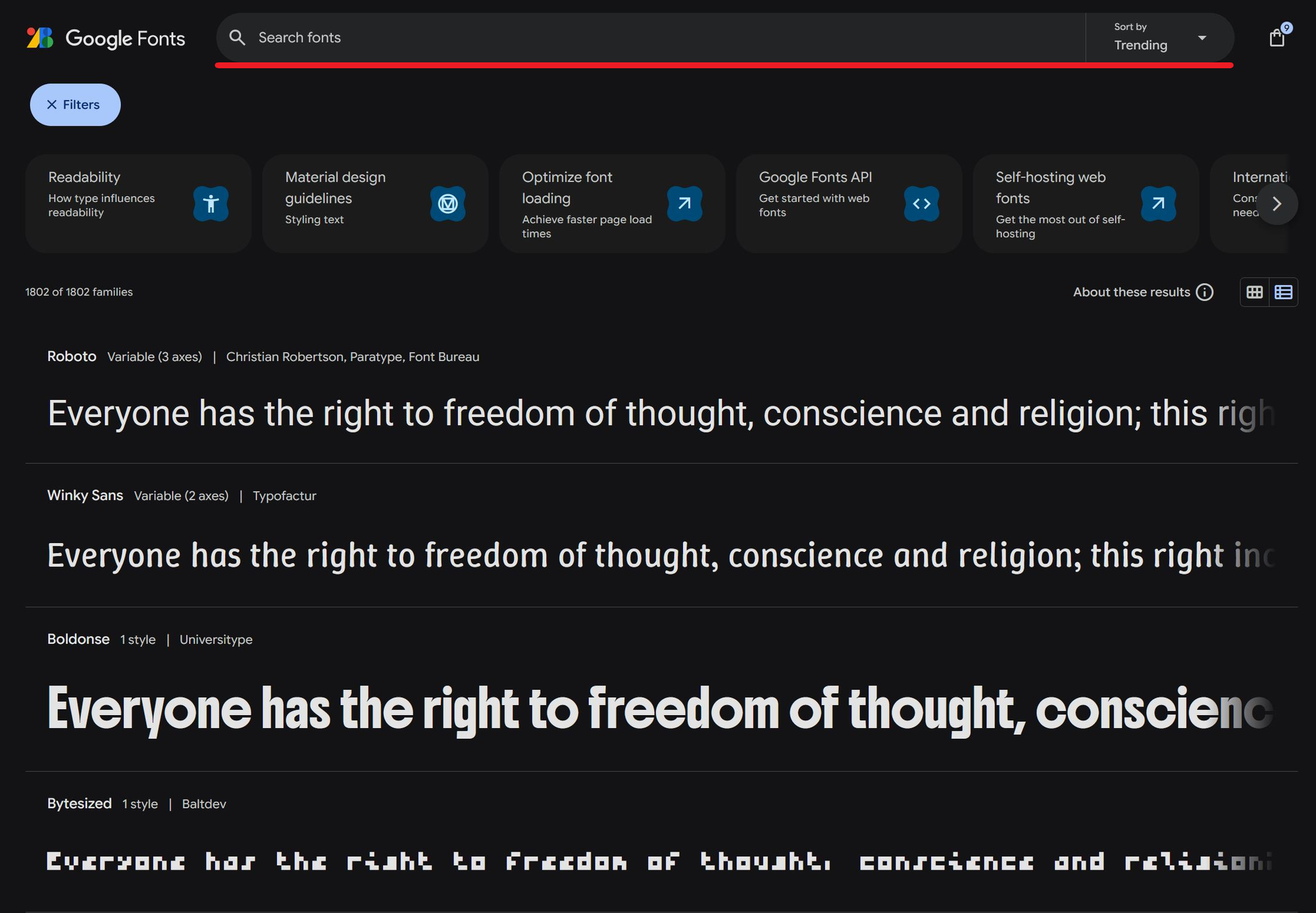
If no results appear, it’s time to start looking for a close alternative. As mentioned earlier, this is a visual process, so having a reference image of your desired font can be extremely helpful when finding the closest match. If this is your first time browsing for fonts, the process can take a bit of practice, so follow along step by step.
1. Enter a Preview Text
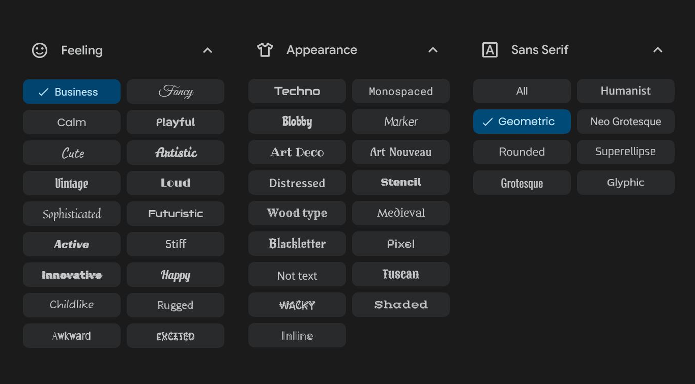
To begin narrowing down the extensive list, use the filtering tools on the left-hand side. These filters provide visual descriptors to help refine your search. At the top of the sidebar, there’s also a Preview textbox where you can enter a word or phrase to display across all fonts. This is especially useful if you have an existing title or caption you want to match.
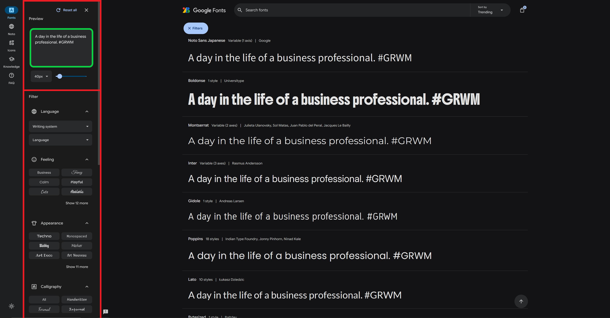
2. Apply Font Filters
Using the filter options, start selecting descriptors to narrow the available fonts. You don’t need to choose something in every category — starting broad and gradually narrowing your search is often more effective. The filter menu is designed to be used from top to bottom, so starting with filters near the top will typically lead to better results.
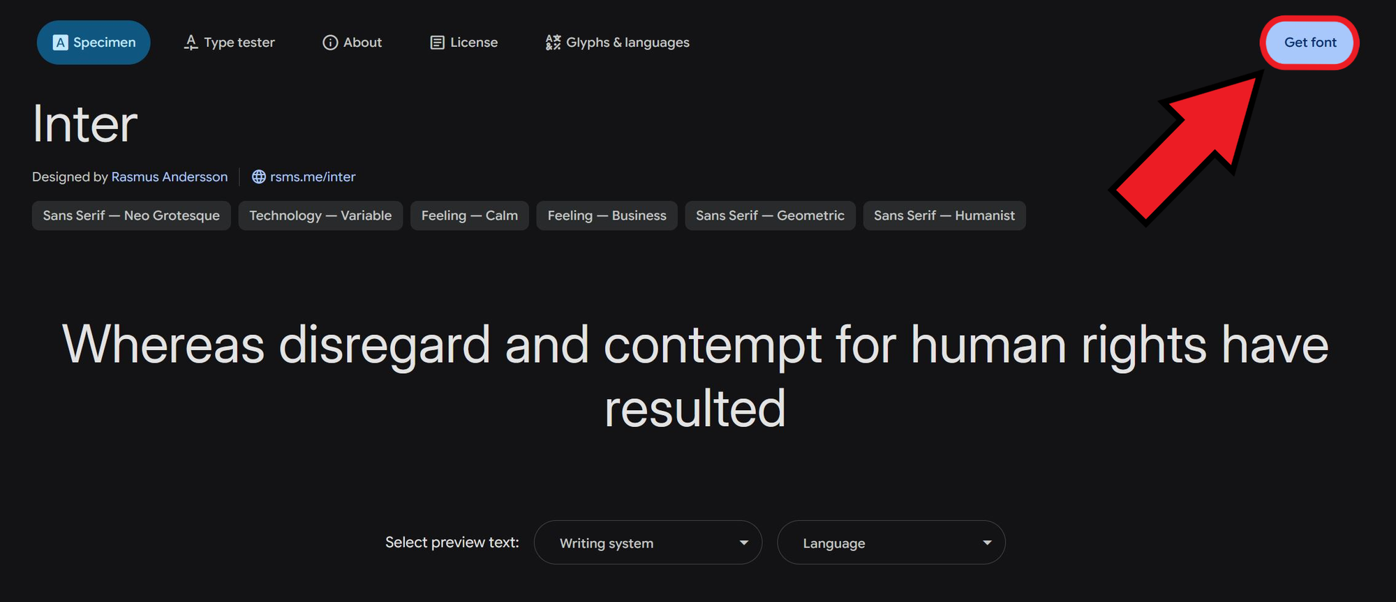
3. Save and Download Your Fonts
Once you find a font you like, click on it and select the Get font button in the top right corner. This won’t download the font to your device yet, but it will save it to your personal Google Fonts list.
From here, you can continue browsing or download your selected fonts by clicking the bag icon in the top right corner and choosing Download all.
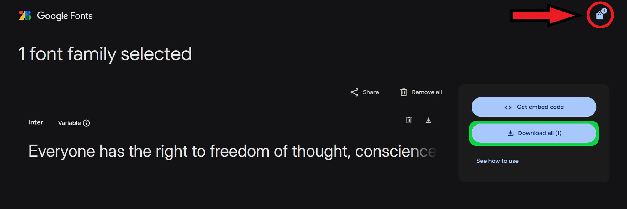
Your selected fonts will be saved to your device in the universal .TTF file format, making them compatible with any platform that supports custom font uploads.
4. Upload Your Font to Kapwing
Uploading a font to Kapwing is quick and easy. Here’s a quick recap of the steps: open the font dropdown menu → select Browse All Fonts → click Upload Font → choose your font file to add it to your library.
Once uploaded, the font will appear under its original file name. Consider renaming your font file to something memorable before uploading so it's easier to locate in your fonts list later.
The Best Alternatives to Popular CapCut Fonts
If you’re missing specific fonts from CapCut, don’t worry — many of them are available on other platforms, and those that aren’t can usually be replicated with close alternatives. Below are some of the most popular CapCut fonts and where to find matching styles.
Brat
This font was largely popularized during the summer of 2024 as it was used in Brat style video edits with high-energy, alternative stylings.
Alternative: Available on Kapwing under the name Arial. For best results, use all lowercase letters.
Anton
A bold, modern sans-serif commonly used in aesthetic vlogs and minimalist edits. It offers strong visibility, especially in short-form content.
Alternative: Available on Kapwing under the same name.
Bright
A playful, modern font inspired by 1970s aesthetics. With retro styles trending in 2025, Bright is a great option for eye-catching and stylish video captions.
Alternative: Similar fonts available for download include Shrikhand and Miltonian Tattoo.
New York
Modern, professional, and distinguished — ideal for adding a boutique or luxury feel to your content. It’s often used to showcase high-end products.
Alternative: A close match is Aref Ruqaa Ink, available for download.
Delicacy
A handwritten-style font that works well for personal, lighthearted content. While visually appealing, it may be less readable in fast-paced videos.
Alternative: Similar downloadable fonts include Nothing You Could Do and Cedarville Cursive.
Suggested Alternatives
In addition to these CapCut-specific fonts, here are some handpicked alternatives available for free on Google Fonts.

- Inter: A direct alternative to the Brat font. It’s concise, clean, and works well in all-lowercase for a Brat-style video edit.
- Playfair Display: Elegant and formal, this serif font adds a tasteful touch for more refined projects.
- Trade Winds: Bold and dynamic, this font grabs attention quickly and sets a strong tone.
- Vast Shadow: With high contrast and excellent readability, it’s ideal for bold labels or titles
- Doto: Stylized and unique, but best used sparingly — its display makes it less suited for frequent use, like in video captions.
Choosing the Right Font for Images and Videos
Once you've found your font, the next step is using it effectively in your content. Fonts play a major role in setting the tone of your visuals, whether you re adding them to video captions, thumbnails, or title cards.
Here are a few key factors to keep in mind:
- Readability: Choose a font that’s easy to read, especially for short-form content. Since most viewers watch on mobile devices and content moves quickly, overly decorative or complex fonts can be hard to follow and may reduce viewer engagement.

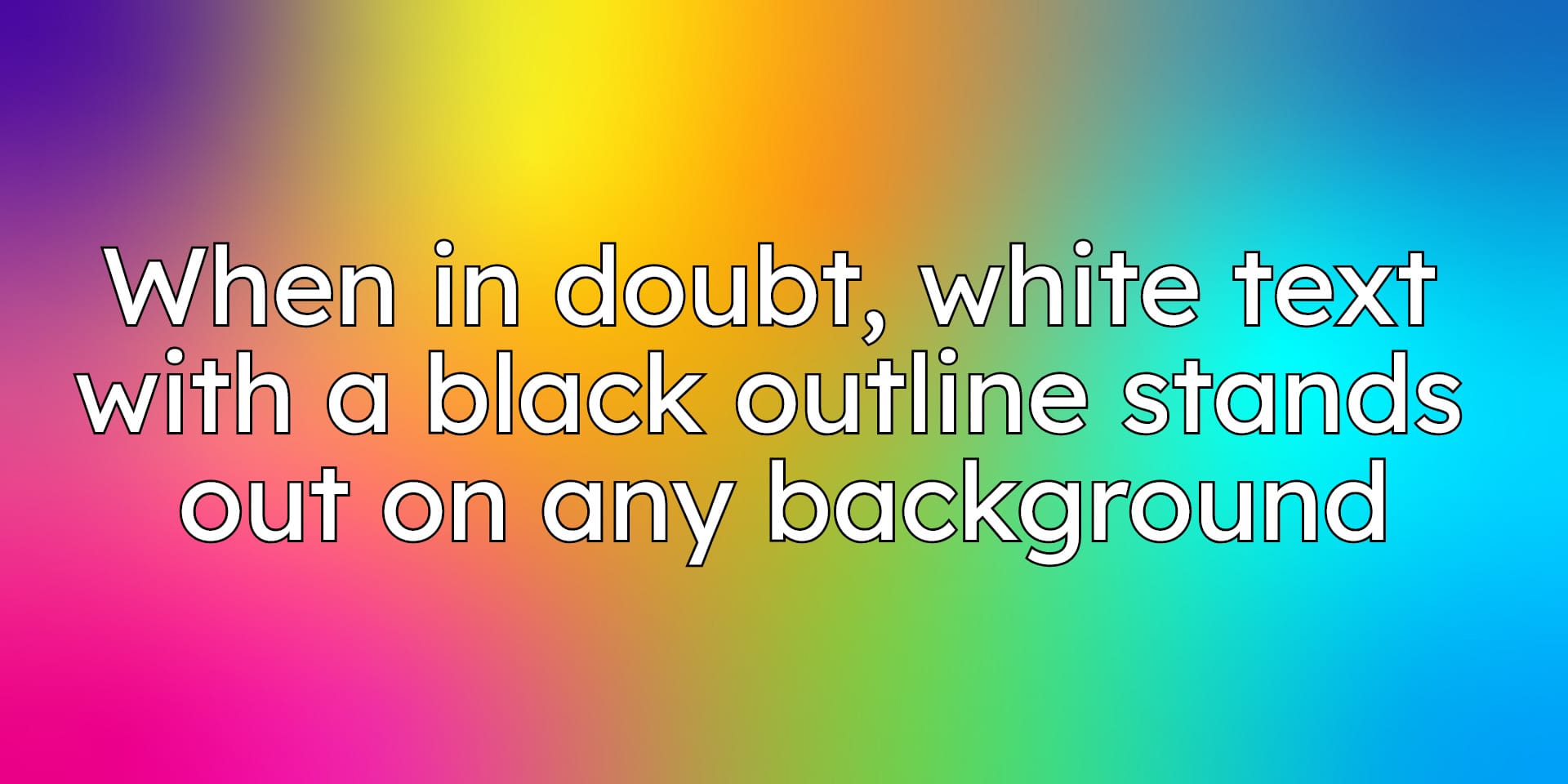
- Contrast: Ensure text stands out against your video background. High-contrast captions, often with outlines or shadows, make subtitles easier to read in any lighting.
- Size and Placement: Make sure your text doesn’t cover important parts of the video or overlap with platform interface elements like captions, buttons, or usernames. Using a Safe Zone template — especially for platforms like TikTok and Instagram — can help keep your text visible and well-positioned.
- Customization Options: Adjusting text color, adding effects, or using simple animations can enhance your video's overall style. Consistently applying these customizations also helps build a recognizable look, making your content easier for viewers to identify.
Keeping these details in mind when adding text to any project will ensure it is professional and accessible.


